Button spark
Info
Button spark is available in 6.1.0-beta.6
The button spark inserts a Home Assistant ha-button element as a DOM sibling immediately before or after a target element inside a forged element.
The button can display:
- a text label (
label) - an icon in the label position (
icon) - a leading icon (
start_icon) - a trailing icon (
end_icon)
icon and label are mutually exclusive — when icon is set, the icon is placed in ha-button's label slot and label is ignored.
When only icon is set (no label), the button automatically receives styling to match Home Assistant's icon button.
Optionally the button can be made interactive with tap/hold/double-tap actions.
Basic usage
Add a button entry to forge.sparks with either after or before to specify the target element and where the button is inserted relative to it.
The after/before value is a selector that locates the target element within the forged element. It supports the same DOM navigation syntax as UIX styles, including $ to cross shadow-root boundaries.
type: custom:uix-forge
forge:
  mold: card
  sparks:
    - type: button
      after: hui-tile-card $ ha-tile-icon
      label: Toggle
      entity: light.living_room
      tap_action:
        action: toggle
element:
  type: tile
  entity: light.living_room
Tip
You can use the uix_forge_path() DOM helper to take the guesswork out of finding the right path for after/before.
Configuration
| Key | Type | Required | Default | Description |
|---|---|---|---|---|
type |
string |
✅ | — | Must be button. |
after |
string |
one of after/before ✅ |
— | UIX selector for the reference element. The button is inserted as a sibling after the matched element. |
before |
string |
one of after/before ✅ |
— | UIX selector for the reference element. The button is inserted as a sibling before the matched element. |
entity |
string |
— | Entity ID passed to action handlers (e.g. toggle). Required for entity-based actions. |
|
icon |
string |
— | MDI icon string (e.g. mdi:lightbulb) placed in the label slot of the button. Mutually exclusive with label. |
|
color |
string |
— | Icon color when in icon-only mode (e.g. red, var(--primary-color)). Only applied when icon is set. |
|
label |
string |
"" |
Text label displayed inside the button. Mutually exclusive with icon. |
|
start_icon |
string |
— | MDI icon string (e.g. mdi:play) displayed before the label. |
|
end_icon |
string |
— | MDI icon string (e.g. mdi:chevron-right) displayed after the label. |
|
variant |
string |
— | Button color variant. One of brand, neutral, danger, warning, success. When omitted, the default Home Assistant button variant brand is used, except when icon is set in which case neutral is default. |
|
appearance |
string |
— | Button appearance. One of accent, filled, plain. When omitted, the default Home Assistant button appearance accent is used, except when icon is set in which case plain is default. |
|
size |
string |
— | Button size which can be small or medium. |
|
tap_action |
action | — | Action to perform on tap. | |
hold_action |
action | — | Action to perform on hold. | |
double_tap_action |
action | — | Action to perform on double tap. |
Note
- Exactly one of
afterorbeforemust be provided. - The spark targets the first element matched by
after/before. - The inserted
ha-buttonis placed in a containing<div>inside the same parent as the target element — it is a sibling, not a child. iconandlabelare mutually exclusive. Wheniconis set,labelis ignored.- Margin styling of
-6pxis applied which allows for button to align nicely in various places in Home Assistant. This margin can be control by the CSS variable--uix-button-margin. - When only
iconis set (nolabel), the button automatically receives styling to match Home Assistant's icon button.
Actions
When one or more action keys are set (tap_action, hold_action, double_tap_action), the button fires the corresponding Home Assistant action. Provide entity when using entity-based actions such as toggle or more-info.
type: custom:uix-forge
forge:
  mold: card
  sparks:
    - type: button
      after: hui-tile-card $ ha-tile-icon
      label: Living Room
      entity: light.living_room
      tap_action:
        action: toggle
      hold_action:
        action: more-info
element:
  type: tile
  entity: light.bed_light
Note
When used inside a tile card the button's click events are isolated from the tile card's own action handler — only the button's configured actions fire.
Examples
Button after the tile icon with a toggle action and light icon
type: custom:uix-forge
forge:
  mold: card
  sparks:
    - type: button
      after: hui-tile-card $ ha-tile-icon
      label: Living Room
      end_icon: mdi:lightbulb-fluorescent-tube-outline
      entity: light.living_room
      tap_action:
        action: toggle
element:
  type: tile
  entity: light.bed_light
Button before the tile icon with a danger variant
type: custom:uix-forge
forge:
  mold: card
  sparks:
    - type: button
      before: hui-tile-card $ ha-tile-icon
      label: Turn off
      variant: danger
      appearance: plain
      entity: light.living_room
      tap_action:
        action: call-service
        service: light.turn_off
        target:
          entity_id: light.living_room
element:
  type: tile
  entity: light.bed_light
Button with start and end icons
type: custom:uix-forge
forge:
  mold: card
  sparks:
    - type: button
      after: hui-tile-card $ ha-tile-icon
      start_icon: mdi:play
      label: Scene
      end_icon: mdi:chevron-right
      tap_action:
        action: navigate
        navigation_path: /lovelace/scenes
element:
  type: tile
  entity: light.bed_light
Icon-only button
type: custom:uix-forge
forge:
  mold: card
  sparks:
    - type: button
      before: hui-tile-card $ ha-tile-info
      icon: mdi:lightbulb
      color: var(--warning-color)
      entity: light.living_room
      tap_action:
        action: toggle
element:
  type: tile
  entity: light.bed_light
Button with tile card styling for spacing with flex css properties
Also included is a  Tooltip spark
type: custom:uix-forge
forge:
  mold: card
  grid_options:
    columns: 12
    rows: 1
  sparks:
    - type: tooltipa
      for: hui-tile-card $ ha-button
      content: Toggle Special Switch
    - type: button
      after: hui-tile-card $ ha-tile-info
      label: Press me
      variant: neutral
      appearance: plain
      end_icon: mdi:test-tube
      entity: input_boolean.test_boolean
      tap_action:
        action: toggle
      hold_action:
        action: more-info
element:
  type: tile
  entity: light.bed_light
  vertical: false
  features_position: bottom
  uix:
    style: |
      ha-tile-info {
        flex: 2;
      }
      ha-button {
        margin-top: -2px;
        flex: 1;
      }
Variant and appearance
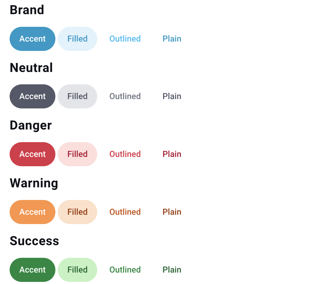
Button variant can be one of brand, neutral, danger, warning, success. When omitted, the default Home Assistant button variant brand is used.
Button appearance can be one of accent, filled, plain. When omitted, the default Home Assistant button appearance accent is used.
Button variant and appearance image