Styling cards
Cards are styled by adding the following to the card configuration:
uix:
  style: <styles>
In the simplest form, <styles> is a string of CSS which will be injected into the appropriate element based on the card type. See Concepts - application for a detailed description on where UI eXtension is applied.
Note
UI eXtension only works on cards that are contained by a <hui-card> element, or contain a <ha-card> element. This includes almost every standard Home Assistant Frontend card, and most custom cards.
For a card contained by a <hui-card> element, which is almost every standard Home Assistant Frontend card, styles are injected into a shadowRoot and the bottom most element is :host, though in most cases the first element in the shadowRoot is <ha-card>. For many custom cards which do not take advantage of the modern <hui-root> container, but contain a <ha-card> element, the styles are injected into ha-card and the bottommost element is <ha-card>. See Concepts - application for more details.
Tip
Home Assistant themes make use of CSS variables. Those can both be set and used in UIX - prepended by two dashes:
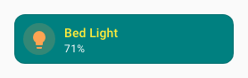
type: tile
entity: light.bed_light
vertical: false
features_position: bottom
uix:
  style: |
    ha-card {
      --ha-card-background: teal;
      --ha-tile-info-primary-color: var(--yellow-color);
      --ha-tile-info-secondary-color: var(--white-color);
    }
You can also optionally set a local Home Assistant theme for just that styled element. The theme can contain UIX Themes.
uix:
  theme: my-awesome-theme
  style: |
    ha-card {
      color: var(--primary-color);
    }
uix.theme overrides the inherited/current theme for that UIX node and its UIX child paths unless a child sets its own theme. See UIX Themes - Override with uix.theme for a full example.