Styling icons
With UI eXtension installed, the ha-state-icon, <ha-icon> or ha-svg-icon elements - used, for example, by tile, entities, glance, heading and many more cards can have its icon and color set using CSS variables either directly in UIX styling on the card or by theme.
Specifying for an entity override
Define CSS variables of the form --uix-icon-for-<entity_id> and/or --uix-icon-color-for-<entity_id>, where every . in the entity ID is replaced with _. When an icon is rendered its icon and/or color is replaced with the supplied icon and/or color.
Templates are supported. For use see Full theme example.
Tip
- The variable can be set at any ancestor level in the DOM. UIX will detect it on the element via computed styles. If the variable is not set, or the element's entity does not match, the original icon is left unchanged.
- To style overrides for Home Assistant dashboards add
--uix-icon-for-<entity_id>and/or--uix-icon-color-for-<entity_id>to theme variablesuix-root(-yaml)anduix-more-info(-yaml). - To style overrides for config and UI editing add
--uix-icon-for-<entity_id>and/or--uix-icon-color-for-<entity_id>to theme variablesuix-config(-yaml)anduix-dialog(-yaml). - To style override for other UIX stylable panels add
--uix-icon-for-<entity_id>and/or--uix-icon-color-for-<entity_id>to the appropriate theme variable. e.g. For History panel add the overrides touix-history(-yaml).
Specifying generic override
Define generic CSS variables --uix-icon and/or --uix-icon-color in the context of the icon you wish to override.
When an icon is rendered its icon and/or color is replaced with the supplied icon and/or color.
Templates are supported.
Tip
- If both
--uix-iconand--uix-icon-for-<entity_id>are defined,--uix-icontakes precedence. - If both
--uix-icon-colorand--uix-icon-color-for-<entity_id>are defined,--uix-icon-colortakes precedence. - In some cases to be able to override an icon you need to define an icon in the card's config. e.g.
headingcard. Without an icon set in config, no icon is rendered for UIX to override. - Special care needs to be taken for elements that use more than the single icon in the
:host, like when a tile icon also has a badge. In that case set the--uix-iconstyling to specific icon. See example.
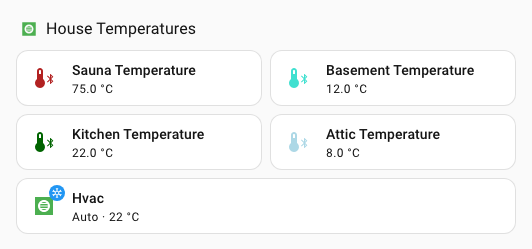
Generic override example
  - type: heading
    heading: House Temperatures
    heading_style: title
    icon: mdi:checkbox-blank-outline
    uix:
      style: |
        ha-icon {
          --uix-icon: {{ 'mdi:hvac' if is_state('climate.hvac', 'auto') else 'mdi:hvac-off' }};
          --uix-icon-color: {{ 'var(--state-climate-auto-color)' if is_state('climate.hvac', 'auto') else 'var(--state-inactive-color)' }};
        }
  - type: tile
    entity: sensor.sauna_temperature
    uix:
      style: |
        ha-tile-icon {
          --uix-icon: mdi:thermometer-bluetooth;
          --uix-icon-color:
          {%- set raw = states(config.entity) -%}
          {%- if raw in ['unknown', 'unavailable', 'none'] -%} gray;
          {%- else -%}
          {%- set state = raw|float(-5) -%}
          {%- if state < 5 -%} dodgerblue
          {%- elif state < 10 -%} lightblue
          {%- elif state < 15 -%} turquoise
          {%- elif state < 20 -%} green
          {%- elif state < 25 -%} darkgreen
          {%- elif state < 30 -%} orange
          {%- elif state < 35 -%} crimson
          {%- else -%} firebrick
          {%- endif -%};
          {%- endif -%}
        }
  - type: tile
    entity: sensor.basement_temperature
    uix:
      style: |
        ha-tile-icon {
          --uix-icon: mdi:thermometer-bluetooth;
          --uix-icon-color:
          {%- set raw = states(config.entity) -%}
          {%- if raw in ['unknown', 'unavailable', 'none'] -%} gray;
          {%- else -%}
          {%- set state = raw|float(-5) -%}
          {%- if state < 5 -%} dodgerblue
          {%- elif state < 10 -%} lightblue
          {%- elif state < 15 -%} turquoise
          {%- elif state < 20 -%} green
          {%- elif state < 25 -%} darkgreen
          {%- elif state < 30 -%} orange
          {%- elif state < 35 -%} crimson
          {%- else -%} firebrick
          {%- endif -%};
          {%- endif -%}
        }
  - type: tile
    entity: sensor.kitchen_temperature
    uix:
      style: |
        ha-tile-icon {
          --uix-icon: mdi:thermometer-bluetooth;
          --uix-icon-color:
          {%- set raw = states(config.entity) -%}
          {%- if raw in ['unknown', 'unavailable', 'none'] -%} gray;
          {%- else -%}
          {%- set state = raw|float(-5) -%}
          {%- if state < 5 -%} dodgerblue
          {%- elif state < 10 -%} lightblue
          {%- elif state < 15 -%} turquoise
          {%- elif state < 20 -%} green
          {%- elif state < 25 -%} darkgreen
          {%- elif state < 30 -%} orange
          {%- elif state < 35 -%} crimson
          {%- else -%} firebrick
          {%- endif -%};
          {%- endif -%}
        }
  - type: tile
    entity: sensor.attic_temperature
    uix:
      style: |
        ha-tile-icon {
          --uix-icon: mdi:thermometer-bluetooth;
          --uix-icon-color:
          {%- set raw = states(config.entity) -%}
          {%- if raw in ['unknown', 'unavailable', 'none'] -%} gray;
          {%- else -%}
          {%- set state = raw|float(-5) -%}
          {%- if state < 5 -%} dodgerblue
          {%- elif state < 10 -%} lightblue
          {%- elif state < 15 -%} turquoise
          {%- elif state < 20 -%} green
          {%- elif state < 25 -%} darkgreen
          {%- elif state < 30 -%} orange
          {%- elif state < 35 -%} crimson
          {%- else -%} firebrick
          {%- endif -%};
          {%- endif -%}
        }
  - type: tile
    entity: climate.hvac
    grid_options:
      columns: 12
      rows: 1
    uix:
      style: |
        ha-state-icon {
          --uix-icon: {{ 'mdi:hvac' if is_state('climate.hvac', 'auto') else 'mdi:hvac-off' }};
          --uix-icon-color: {{ 'var(--state-climate-auto-color)' if is_state('climate.hvac', 'auto') else 'var(--state-inactive-color)' }};
        }
Full theme example
This example uses two macros in UIX theme and applying those macros in styling for theme variables uix-root-yaml and uix-more-info-yaml. While the root selector .: is the only selector used, the example uses the -yaml variants as you may already have these variants in your theme.
Theme:
uix-doc-icon-for-entity-theme:
  uix-theme: uix-doc-icon-for-entity-theme
  uix-macros-yaml: |
    temp_icon_color:
      params:
        - entity_id
      template: >
        {%- set entityString = entity_id.replace('.','_') -%}
        --uix-icon-for-{{ entityString }}: mdi:thermometer-bluetooth;
        --uix-icon-color-for-{{ entityString }}:
        {%- set raw = states(entity_id) -%}
        {%- if raw in ['unknown', 'unavailable', 'none'] -%} gray;
        {%- else -%}
        {%- set state = raw|float(-5) -%}
        {%- if state < 5 -%} dodgerblue
        {%- elif state < 10 -%} lightblue
        {%- elif state < 15 -%} turquoise
        {%- elif state < 20 -%} green
        {%- elif state < 25 -%} darkgreen
        {%- elif state < 30 -%} orange
        {%- elif state < 35 -%} crimson
        {%- else -%} firebrick
        {%- endif -%};
        {%- endif -%}
    temp_icon_color_all:
      template: >
        {% set entities = states.sensor
          | selectattr('attributes.device_class', 'defined')
          | selectattr('attributes.device_class', 'eq', 'temperature')
          | selectattr('attributes.state_class', 'defined')
          | selectattr('attributes.state_class', 'eq', 'measurement')
          | map(attribute='entity_id') | list %}
        {% for entity in entities %}
          {{ temp_icon_color(entity) }}
        {% endfor %}

  uix-root-yaml: |
    .: |
      :host {
        {{ temp_icon_color_all() }}
      }

  uix-more-info-yaml: |
    .: |
      :host {
        {{ temp_icon_color_all() }}
      }
Tip
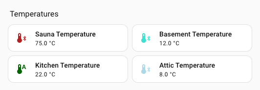
--uix-icon and --uix-icon-color take precedence over --uix-icon-for-<entity_id> and/or --uix-icon-color-for-<entity_id>. See the sensor.kitchen_temperature tile in the example.
Dashboard cards (section):
type: grid
cards:
  - type: heading
    heading: Temperatures
    heading_style: title
  - type: tile
    entity: sensor.sauna_temperature
    icon: ''
    vertical: false
    features_position: bottom
  - type: tile
    entity: sensor.basement_temperature
  - type: tile
    entity: sensor.kitchen_temperature
    uix:
      style: |
        ha-tile-icon {
          {% if is_state('climate.hvac', 'auto') %}
            --uix-icon: mdi:thermometer-auto;
          {% endif %}
        }
  - type: tile
    entity: sensor.attic_temperature