Themes
Getting started
To get started, you need themes enabled in Home Assistant.
The best way to do this is to create a new /config/themes/ directory, and then add the following to your configuration.yaml
frontend:
  themes: !include_dir_merge_named themes/
After restarting Home Assistant, you can place theme files in that directory, load them with the Frontend reload_theme service.
Theme files are normally yaml documents, which contain settings for the many themeable variables available in Home Assistant.
/config/themes/red.yaml
red-theme:
  primary-color: red
  ha-card-border-radius: 20px
Theme name
The theme name must be on the first row, and the rest should be indented one level.
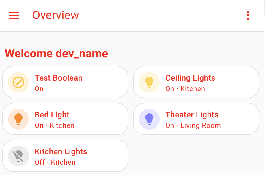
Basic UIX theme
Theme variable
The theme MUST define a uix-theme variable whose value selects the theme
definition UIX uses for UIX styles, macros, and fonts. uix-theme normally matches the Home
Assistant theme name, but may point to another theme when you want to reuse
its UIX configuration.
uix-theme matching Home Assistant theme.
my-awesome-theme:
  uix-theme: my-awesome-theme

  ... UIX theme variables, styles, macros go here ...
uix-theme pointing to another theme.
theme-mods:
  ... UIX theme variables, styles, macros go here ...

my-awesome-theme:
  uix-theme: theme-mods
/config/themes/red.yaml
red-theme:
  uix-theme: red-theme # this variable must match a valid Home Assistant theme name including case

  primary-color: red
  primary-text-color: white
  ha-card-border-radius: 20
Once uix-theme is set, we're ready to do some really powerful things.
To apply the basic functionality of UIX globally, you can use the uix-<thing> variables, where <thing> is any theme variable.
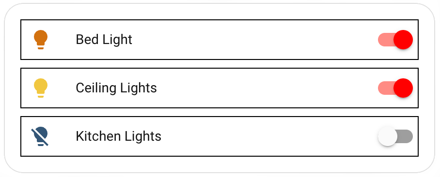
For example, say you want a border around every row in an entities card, you may do something like the following.
type: entities
entities:
  - entity: light.bed_light
    style: |
      :host {
        display: block;
        border: 1px solid black;
      }
  - entity: light.ceiling_lights
    uix:
      style: |
        :host {
          display: block;
          border: 1px solid black;
        }
  - entity: light.kitchen_lights
    uix:
      style: |
        :host {
          display: block;
          border: 1px solid black;
        }
This can now be added to our theme instead.
red-theme:
  uix-theme: red-theme
  ...
  uix-row: |
    :host {
      display: block;
      border: 1px solid black;
    }
uix-<thing> variables
uix-<thing> variables contain strings containing CSS code, and must start with | or > and be indented at least one step.
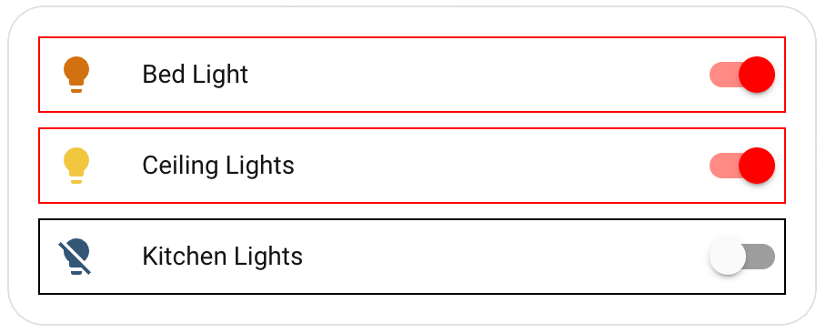
Just like normal, you can use Jinja2 templating to process the styles.
red-theme:
  uix-theme: red-theme
  ...
  uix-row: |
    :host {
      display: block;
      border: 1px solid {% if is_state(config.entity, 'on') %} red {% else %} black {% endif %};
    }
Classes
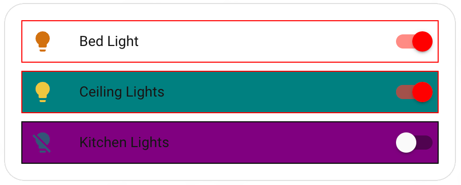
UIX lets you set a CSS class to elements. You can then use this in your theme.
red-theme:
  uix-theme: red-theme
  ...
  uix-row: |
    ...
    :host(.teal) {
      background: teal;
    }
    :host(.purple) {
      background: purple;
    }
type: entities
entities:
  - entity: light.bed_light
  - entity: light.ceiling_lights
    uix:
      class: teal
  - entity: light.kitchen_lights
    uix:
      class: purple
Navigating the shadow DOM
Just like with UIX styles applied to a card, you can traverse the shadow DOM structure of the thing you want to style. To do this, you need to specify the variable uix-<thing>-yaml, and then the syntax is exactly the same.
red-theme:
  uix-theme: red-theme
  ...
  uix-row-yaml: |
    ...
    hui-generic-entity-row $ state-badge $: |
      @keyframes pulse {
        50% {
          opacity: 0.5;
        }
      }
      ha-state-icon {
        animation: pulse 2s infinite;
      }
Theme variables MUST be strings
While the value of the uix-<thing>-yaml variable is actually yaml, as far as the theme is concerned it MUST be a string, which in turn contains more strings.
Local theme override with uix.theme
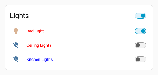
You can force one styled card/row/badge/element to use a different Home Assistant theme than the currently active global theme. uix.theme takes precedence over inherited/current theme for that UIX node.
Main red row theme:
row-red:
  uix-theme: row-red
  uix-row-yaml: |
    hui-generic-entity-row $: |
      .info{
        color: red;
      }
Override blue row theme:
row-blue-override:
  uix-theme: row-blue-override
  uix-row-yaml: |
    hui-generic-entity-row $: |
      .info{
        color: blue;
      }
Entities card with theme override for one row:
type: entities
title: Lights
entities:
  - entity: light.bed_light
  - entity: light.ceiling_lights
  - entity: light.kitchen_lights
    uix:
      theme: row-blue-override
Take caution where you use theme overrides
Styling and theming in Home Assistant can get quite complex. You may expect a CSS variable to apply and find it does not. For example, if you apply --primary-text-color: color; to an entities row either by direct UIX styling to :host {} or uix.theme override you may expect the entities text to be the color you have set to --primary-text-color. However in this case color style is set at the ha-card element of the entities card, so this override will have no effect.
Updating uix-<thing> variable to uix-<thing>-yaml variable
UIX theme variable precedence
uix-<thing>-yaml always takes precedence over uix-<thing> which is NOT used if uix-<thing>-yaml is present in the theme.
As you develop your UIX themes you are likely to come to a point where you started with straight CSS strings with uix-<thing> but need to update to use uix-<thing>-yaml. You can do this by using the root yaml selector .:. Below is the full example of the red theme using uix-row-yaml.
red-theme:
  uix-theme: red-theme # this variable must match a valid Home Assistant theme name including case

  primary-color: red
  ha-card-border-radius: 20px

  uix-row-yaml: |
    .: |
      :host {
        display: block;
        border: 1px solid {% if is_state(config.entity, 'on') %} red {% else %} black {% endif %};
      }
      :host(.teal) {
        background: teal;
      }
      :host(.purple) {
        background: purple;
      }
    hui-generic-entity-row $ state-badge $: |
      @keyframes pulse {
        50% {
          opacity: 0.5;
        }
      }
      ha-state-icon {
        animation: pulse 2s infinite;
      }
Theme variables
uix-carduix-rowuix-glanceuix-badgeuix-heading-badgeuix-assist-chipuix-elementuix-entity-markeruix-rootuix-viewuix-more-infouix-sidebaruix-configuix-appuix-panel-customuix-top-app-bar-fixeduix-dialoguix-toastuix-grid-sectionuix-calendaruix-todouix-historyuix-states-history-chartsuix-draweruix-view-backgrounduix-persistent-notification-item
Also <any variable>-yaml.
Fonts
Use uix-fonts to load web fonts when a global theme is selected. UIX creates FontFace objects and registers them in document.fonts, making the fonts available to Home Assistant components, including those inside shadow roots. This setting only loads fonts; use theme variables or UIX styles to choose where they are used.
Home Assistant theme values must be strings, so put the font mapping inside a | block:
retro-theme:
  uix-theme: retro-theme
  uix-fonts: |
    ChicagoFLF:
      source: url("https://cdn.jsdelivr.net/npm/@sakun/system.css@0.1.11/fonts/ChicagoFLF.woff2") format("woff2")
    dashboard-regular:
      family: My Dashboard Font
      source: url("/local/fonts/dashboard-regular.woff2") format("woff2")
      descriptors:
        weight: "400"
        style: normal
        display: swap
    dashboard-bold:
      family: My Dashboard Font
      source: url("/local/fonts/dashboard-bold.woff2") format("woff2")
      descriptors:
        weight: "700"

  ha-font-family-body: '"ChicagoFLF", sans-serif'
  ha-font-family-heading: '"ChicagoFLF", sans-serif'
  uix-card: |
    ha-card {
      font-family: "ChicagoFLF", sans-serif;
    }
| Key | Required | Description |
|---|---|---|
family |
No | Font family name to use in CSS. Defaults to the mapping key. Set it when multiple named entries share a family. |
source |
Yes | A CSS font source, such as url("/local/fonts/example.woff2") format("woff2"). Supports comma-separated fallbacks and local("Font Name"). Use font files, not a provider's CSS stylesheet URL. |
descriptors |
No | Mapping of FontFace descriptors using JavaScript names: weight, style, stretch, display, unicodeRange, featureSettings, variationSettings, ascentOverride, descentOverride, and lineGapOverride. Values are strings; weight also accepts a number. |
Use separate entries for each weight or style. A variable font can specify a range such as weight: "100 900". Local files in /config/www/fonts/ are served as /local/fonts/. Remote font servers must allow cross-origin font requests.
The descriptor names map directly to the browser FontFace API. Support for variationSettings, ascentOverride, descentOverride, and lineGapOverride varies by browser; Safari may ignore some of them.
Fonts follow the global Home Assistant theme, including the selected modes.light or modes.dark overrides. A mode's uix-fonts replaces the base mapping; use uix-fonts: "{}" for a mode with no custom fonts. If uix-theme points to another theme, UIX reads the font mapping from that theme, just as it does for UIX styles. Legacy card-mod-theme references are also supported. Selecting a theme only on a view, card, or through uix.theme does not load its fonts.
UIX starts loading fonts without waiting to apply styles. Identical entries are registered once. Switching themes or reloading themes removes UIX font registrations that are no longer needed, including fonts still loading. Fonts registered by Home Assistant or other integrations are left alone. Invalid entries and failed downloads produce browser-console warnings without blocking other fonts or theme styles; reload themes to retry a failed download.
uix-fonts accepts a static YAML mapping without templates. It does not insert CSS or <style> elements into the document head.
Dialogs
uix-dialog and uix-dialog-yaml apply to styles rooted in the dialog element of dialogs which may be ha-dialog, ha-adaptive-dialog, or ha-drawer (notification uses a dialog with an element using the drawer type). Dialogs will also have their class set to type-<dialog-type> where <dialog-type> will be the dialog element name with any ha- prefix stripped. e.g. UIX will append type-dialog-box to dialog boxes as used by alerts and other dialog boxes. The Home Assistant dialog manager places dialogs in the shadow root of the top <home-assistant> element. The active dialog will be the last child of the shadow root. To view what dialog you wish to target, review the last child of this shadow root node.
See UIX guide Styling dialogs with UI eXtension.
Macros
Themes can define reusable Jinja2 macros available to all cards that use the theme. Macros are specified under the uix-macros-yaml theme key as a YAML dictionary of macro definitions — see Templates - Macros for the full macro configuration reference.
my-awesome-theme:
  uix-theme: my-awesome-theme

  uix-macros-yaml: |
    is_on:
      params:
        - entity_id
      returns: true
      template: "{%- do returns(is_state(entity_id, 'on')) -%}"
    badge_color:
      params:
        - entity_id
        - name: color_on
          default: "'var(--state-active-color)'"
        - name: color_off
          default: "'var(--state-inactive-color)'"
      template: "{{ color_on if is_on(entity_id) else color_off }}"
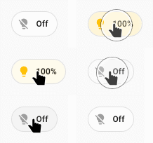
Badge example using theme macros with defaults for badge_color():
  badges:
    - type: entity
      entity: light.bed_light
      tap_action:
        action: toggle
      uix:
        style: |
          ha-badge {
            --badge-color: {{ badge_color(config.entity) }} !important;
          }
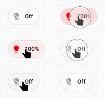
Badge example using theme macros setting color_on named variable to red in the badge_color() macro:
  badges:
    - type: entity
      entity: light.bed_light
      tap_action:
        action: toggle
      uix:
        style: |
          ha-badge {
            --badge-color: {{ badge_color(config.entity, color_on='red') }} !important;
          }
Card-level uix.macros take precedence over theme macros of the same name.
Warning
Theme macros are only available in UIX styling templates, not in UIX Forge element/forge templates.
Use UIX Forge Global foundries to define forge.macros available globally or per mold.