Lock spark
The lock spark overlays a lock icon on any element inside a UIX Forge forged element. While locked, all pointer interactions with the underlying element are blocked. The user unlocks it via a tap, hold, or double-tap, which can require a PIN code, a text passphrase, or a simple confirmation. After a configurable duration the overlay automatically re-locks.
All dialogs for code/passphrase input, confirmation and feedback use native Home Assistant dialogs.
Tip
All the full examples add admins: true to the lock config being used, as you will be an admin when testing. Otherwise it will look like the lock is not working.
Basic usage
Basic usage
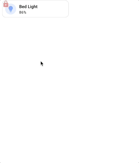
Basic examples includes admins in lock config considering that admins will be implementing lock spark. Remove admins: true if lock will be bypassed for admins.
type: custom:uix-forge
forge:
  mold: card
  sparks:
    - type: lock
      locks:
        - code: 1234
          admins: true
element:
  type: tile
  entity: light.bed_light
Targeting specific elements with for
Targeting example
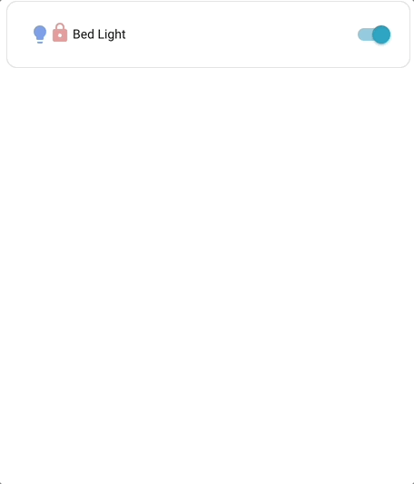
Like other sparks, for accepts the same DOM navigation syntax as UIX styles, including $ to cross shadow-root boundaries.
Here an entities row is the target for the lock. action is hold.
type: entities
entities:
  - type: custom:uix-forge
    forge:
      mold: row
      sparks:
        - type: lock
          for: $ hui-generic-entity-row
          action: hold
          locks:
            - code: 1234
              admins: true
    element:
      entity: light.bed_light
Warning
As rows in entities card are displayed inline (display: inline) deeper element targeting cannot take place as overlays do not work with elements which are displayed inline. This means that lock spark can only apply to an entire entity row.
Lock-matching logic
locks is an ordered list. The first matching entry determines what the current user must do to unlock. An entry matches according to these rules:
| Configuration | Who it matches |
|---|---|
users list present |
Users whose name is in the list. If admins: true, also admins. |
No users list |
All non-admin users not in the except list. |
No users list + admins: true |
All users (admin and non-admin) not in the except list. |
admins is an additive flag. On a no-users-list entry it extends the default scope (all non-admins) to also include admins, making the entry match everyone. Admins are excluded by default from every entry that does not explicitly set admins: true or list them in users.
When an entry has active: false, matched users are not locked (the overlay is hidden for them).
When no entry matches:
permissive: true→ element is accessible for everyone (no overlay shown).permissive: false(default) → admins auto-bypass (no overlay); non-admins are permanently blocked with no unlock path.
Configuration reference
Top-level keys
| Key | Type | Default | Description |
|---|---|---|---|
type |
string | — | Must be lock. |
for |
string | element |
UIX selector for the element to overlay. Default targets the root of the forged element. |
action |
string | tap |
Gesture that triggers the unlock flow. One of tap, hold, double_tap. |
duration |
number or string | 3000 |
How long before the overlay re-locks after a successful unlock. Numbers are milliseconds; strings use human-readable units (e.g. "5s", "1m", "500ms"). |
icon_locked |
string | mdi:lock-outline |
MDI icon shown when locked. |
icon_unlocked |
string | — | MDI icon shown when unlocked. When not set, the lock icon fades out instead of being replaced. |
icon_locked_color |
string | --error-color |
CSS color for the locked icon. |
icon_unlocked_color |
string | --success-color |
CSS color for the unlocked icon (only used when icon_unlocked is set). |
icon_position |
object | when forge mold is row default is {top: 6, left: 30}; when target is ha-tile-icon {top: 3, left: 3} |
Pixel offsets for the icon inside the overlay. Accepts any combination of top, bottom (exclusive pair) and left, right (exclusive pair). Numbers are treated as pixels; strings accept any CSS value. |
icon_size |
number or string | 12px for ha-tile-icon targets, 24px otherwise |
Size of the lock icon. Numbers are treated as pixels (e.g. 18 → 18px); strings are passed through as-is (e.g. "1.5rem"). The CSS variable --uix-lock-icon-size takes precedence over this setting when set via UIX Styling or in a theme. |
permissive |
boolean | false |
When true, elements are accessible if no lock entry matches the current user. |
entity |
string | — | Entity ID used when unlocked_action is a plain HA action. |
unlocked_action |
object | — | Action to execute immediately after a successful unlock. |
locks |
list | [] |
Ordered list of lock entries (see below). |
code_dialog |
object | — | Options forwarded to the code/passphrase dialog (see below). |
code_dialog
Controls the appearance of the PIN / passphrase entry dialog shown when a lock entry requires a code. For the number dialog, title will be prominent, and submit text will show as a tooltip when the tick is hovered over. For the passphrase dialog all options will show prominently.
| Key | Type | Default | Description |
|---|---|---|---|
title |
string | HA default | Dialog title. When omitted Home Assistant's built-in default title is used. |
submit_text |
string | HA default | Label for the confirm/submit button. When omitted Home Assistant's built-in default label is used. |
cancel_text |
string | HA default | Label for the cancel button. When omitted Home Assistant's built-in default label is used. |
unlocked_action
| Value | Effect |
|---|---|
action: element_tap |
Fires the target element's tap_action. |
action: element_hold |
Fires the target element's hold_action. |
action: element_double_tap |
Fires the target element's double_tap_action. |
| Any HA action object | Dispatches that action against entity (e.g. action: toggle). |
Lock entry keys
| Key | Type | Default | Description |
|---|---|---|---|
active |
boolean | true |
Set to false to explicitly unlock for matched users (no overlay). |
code |
string or number | — | Code to enter. Numeric values display the HA numpad; text values display a password field. |
pin |
string or number | — | Alias for code. |
confirmation |
string or boolean | — | Confirmation prompt. Pass true for HA's default localised text, or a custom string. |
users |
list of strings | — | Usernames this entry applies to. |
admins |
boolean | false |
Additive flag. On a no-users-list entry, setting admins: true extends the entry to cover all users (admin and non-admin). On a users-list entry, it additionally covers admins. Admins are excluded from every entry where this is false or unset. |
except |
list of strings | — | Users exempt from this entry (only used when no users list). |
retry_delay |
number or string | — | How long to wait between code attempts after a wrong entry. Numbers are milliseconds; strings use human-readable units (e.g. "10s"). |
max_retries |
number | — | Maximum consecutive wrong attempts before the extended delay kicks in. |
max_retries_delay |
number or string | 30000 |
How long to lock out after max_retries wrong attempts. Numbers are milliseconds; strings use human-readable units (e.g. "30s", "5m"). |
Examples
Same PIN for everyone (including admins)
admins: true extends the entry to cover everyone — a single entry is sufficient:
locks:
  - code: 1234
    admins: true   # applies to all users (non-admins by default + admins because admins: true)
No lock for admins (default) and a specific user
Admins bypass any entry that does not have admins: true or list them in users. Here
user1 is explicitly unlocked, and all other non-admin users must enter a PIN:
locks:
  - active: false
    users:
      - user1
  - code: 1234      # non-admins only (admins are excluded by default)
Confirmation for everyone including admins
locks:
  - admins: true
    confirmation: true
PIN for everyone, no lock for named users
permissive: false
locks:
  - active: false
    users:
      - trusted_user
  - code: 1234
    admins: true   # apply to everyone (including admins)
Different PINs per user group, admins bypass
Because admins: true on a no-users-list entry matches everyone, you cannot create an
admin-specific entry using that approach alone. To give admins their own PIN, list them
explicitly in the users key:
locks:
  - users:
      - admin_user
    code: 9876     # admin_user gets this PIN
  - users:
      - jim
      - alison
    code: 1234
  - users:
      - john
      - jane
    code: 4567
Locked for specific users only (permissive: true)
permissive: true
locks:
  - users:
      - jim
      - alison
    code: 1234
Tile card: execute hold_action on unlock
type: custom:uix-forge
forge:
  mold: card
  sparks:
    - type: lock
      unlocked_action:
        action: element_hold
      locks:
        - code: 1234
          admins: true
element:
  type: tile
  entity: light.bed_light
  hold_action:
    action: toggle
Tile card: toggle entity directly on unlock
type: custom:uix-forge
forge:
  mold: card
  sparks:
    - type: lock
      entity: light.bed_light
      unlocked_action:
        action: toggle
      locks:
        - code: 1234
          admins: true
element:
  type: tile
  entity: light.bed_light
Tile card: lock the tile icon only
Use for to target ha-tile-icon directly — only the icon area is locked, leaving the rest of the tile interactive. The lock icon defaults to 12px, position top: 3px, left: 3px and --uix-lock-icon-padding: 2px in this context to mimic a tile icon badge on the left of the tile icon.
type: custom:uix-forge
forge:
  mold: card
  sparks:
    - type: lock
      for: hui-tile-card $ ha-tile-icon
      locks:
        - code: 1234
          admins: true
element:
  type: tile
  entity: light.bed_light
  tap_action:
    action: toggle
Custom code dialog labels
Use code_dialog to override the title and button labels shown in the PIN / passphrase entry dialog:
type: custom:uix-forge
forge:
  mold: card
  sparks:
    - type: lock
      code_dialog:
        title: 'Enter Pin:'
        submit_text: 'Unlock'
        cancel_text: 'Cancel'
      locks:
        - code: 1234
          admins: true
element:
  type: tile
  entity: light.bed_light
Customizing the overlay appearance
The lock overlay respects a set of CSS custom properties. Set these on the forged element's uix.style (or in a theme) to customise the look:
| CSS variable | Default | Description |
|---|---|---|
--uix-lock-z-index |
10 |
Stack order of the overlay. |
--uix-lock-display |
block |
CSS display of the lock overlay. Adjust for any positioning workarounds required with target element scenarios. |
--uix-lock-opacity |
0.5 |
Opacity of the overlay (icon and background combined). |
--uix-lock-background |
transparent |
Background color of the overlay when locked. |
--uix-lock-background-unlocked |
none |
Background color of the overlay when unlocked. Defaults to no background so --uix-lock-background does not bleed into the unlocked state. |
--uix-lock-background-blocked |
--uix-lock-background |
Background color when the lock is permanently blocked (no unlock path, non-row molds). |
--uix-lock-border-radius |
inherit |
Border radius of the overlay (inherits the target's). |
--uix-lock-icon-size |
24px; 12px when target is ha-tile-icon |
Size of the lock icon. Overrides any icon_size set in spark config. |
--uix-lock-icon-background |
none |
Background of the lock icon element. Useful for adding a colored pill or circle behind the icon. |
--uix-lock-icon-background-unlocked |
--uix-lock-icon-background |
Icon background when the lock is unlocked. Falls back to --uix-lock-icon-background. |
--uix-lock-icon-background-blocked |
--uix-lock-icon-background |
Icon background when the lock is permanently blocked. Falls back to --uix-lock-icon-background. |
--uix-lock-icon-border-radius |
none; 50% when target is ha-tile-icon |
Border radius of the lock icon element. Use 50% for a circle or a large value (e.g. 50px) for a pill shape. |
--uix-lock-icon-padding |
0; 2px when the target is ha-tile-info |
Padding around the lock icon, creating space between the icon and its background. |
--uix-lock-icon-position |
none |
CSS translate value applied to the icon (e.g. 30px 6px). Useful for CSS-only positioning when icon_position is not set in config. |
--uix-lock-icon-fade-duration |
2s |
Duration of the opacity fade when the lock icon fades away on unlock (only used when icon_unlocked is not set). |
--uix-lock-row-background |
--uix-lock-background |
Background color of the overlay when the forge mold is row. |
--uix-lock-row-border-radius |
--uix-lock-border-radius |
Border radius of the overlay when the forge mold is row. |
--uix-lock-row-outlined-blocked |
none |
CSS outline value applied to the overlay in row mold when the lock is permanently blocked. |
Styling examples
Overlay backgrounds
Using UIX Styling to apply a locked background, unlocked background and reduced opacity. A locked icon is also used in this example.
Styling example
type: entities
entities:
  - type: custom:uix-forge
    forge:
      mold: row
      sparks:
        - type: lock
          for: $ hui-generic-entity-row
          duration: 5s
          icon_unlocked: mdi:lock-open-variant-outline
          permissive: true
          locks:
            - code: 1234
              admins: true
      uix:
        style: |
          :host {
            --uix-lock-background: url("data:image/svg+xml,%3Csvg xmlns='http://www.w3.org/2000/svg' width='32' height='32' viewBox='0 0 24 24'%3E%3Cpath fill='red' fill-opacity='.18' d='M18 8h-1V6c0-2.76-2.24-5-5-5S7 3.24 7 6v2H6c-1.1 0-2 .9-2 2v10c0 1.1.9 2 2 2h12c1.1 0 2-.9 2-2V10c0-1.1-.9-2-2-2zm-6 9c-1.1 0-2-.9-2-2s.9-2 2-2 2 .9 2 2-.9 2-2 2zm3.1-9H8.9V6c0-1.71 1.39-3.1 3.1-3.1 1.71 0 3.1 1.39 3.1 3.1v2z'/%3E%3C/svg%3E") 0 0/20px 20px repeat, rgba(200,0,0,0.08);
            --uix-lock-background-unlocked: url("data:image/svg+xml,%3Csvg xmlns='http://www.w3.org/2000/svg' width='32' height='32' viewBox='0 0 24 24'%3E%3Cpath fill='green' fill-opacity='.08' d='M18 8h-1V6c0-2.76-2.24-5-5-5S7 3.24 7 6v2H6c-1.1 0-2 .9-2 2v10c0 1.1.9 2 2 2h12c1.1 0 2-.9 2-2V10c0-1.1-.9-2-2-2zm-6 9c-1.1 0-2-.9-2-2s.9-2 2-2 2 .9 2 2-.9 2-2 2zm3.1-9H8.9V6c0-1.71 1.39-3.1 3.1-3.1 1.71 0 3.1 1.39 3.1 3.1v2z'/%3E%3C/svg%3E") 0 0/20px 20px repeat, rgba(0,200,0,0.04);
            --uix-lock-opacity: 1;
            --uix-lock-border-radius: 8px;
          }
    element:
      entity: light.bed_light
Locked icon when target is a tile icon
Using UIX Styling to apply lock icon background. Here the lock is applied to a tile icon and UIX Styling used to make lock appear like a tile badge.
Styling example
type: custom:uix-forge
forge:
  mold: card
  sparks:
    - type: lock
      for: hui-tile-card $ ha-tile-icon
      icon_unlocked: mdi:lock-open-outline
      duration: 5s
      locks:
        - code: 1234
          admins: true
  uix:
    style: |
      :host {
        --uix-lock-opacity: 1;
        --uix-lock-icon-color: white;
        --uix-lock-icon-background: red;
        --uix-lock-icon-background-unlocked: green;
      }
element:
  type: tile
  entity: light.bed_light
Templates
Like all spark config, locks entries are processed as Jinja2 templates, so you can make active conditional:
- type: lock
  locks:
    - active: "{{ is_state('input_boolean.lock_enabled', 'on') }}"
      code: 1234
      admins: true
Tip
Use the uix_forge_path() helper in your browser DevTools console to find the right for selector for any element you want to lock.