Background spark
The background spark places a styled background layer behind a target element inside a UIX Forge forged element. The background container sits at z-index: -1 so it is rendered below all sibling content without disrupting layout.
Supported background sources (first non-empty value wins):
| Source | Key | Description |
|---|---|---|
| Camera | camera_entity |
Live ha-camera-stream stream. Supports zoom, pan, and position. Shows a spinner while loading. |
| Entity picture | image_entity |
Reads entity_picture from any entity and signs the URL. Shows a spinner while loading. |
| Video | video_url |
<video> element (autoplay, muted, loop). Supports media-source:// URIs. |
| Image URL | image_url |
Static image applied as background-image. Shows a spinner while loading. Supports media-source:// URIs. |
| Solid colour or CSS shorthand | background |
Any CSS background value, or a mapping of sub-properties. |
Tip
When the background spark targets a hui-section (i.e. mold: section), UIX automatically zeros out the div.section-container padding so there is no double-padding effect if a standard HA section background is also active. You can use a standard Home Assistant section background to add a color behind the spark background and set the spark opacity to less than 1 to let the color show through.
Basic usage
type: custom:uix-forge
forge:
  mold: card
  sparks:
    - type: background
      for: hui-tile-card $ ha-card
      background:
        color: "rgba(220, 53, 69, 0.6)"
element:
  type: tile
  entity: light.bed_light
The for value accepts the same DOM navigation syntax as UIX styles, including $ for shadow-root crossings. Use hui-tile-card $ ha-card to target the card surface inside a tile card — the ha-card adapter then automatically applies matching border-radius and margin so the background follows the card's rounded corners.
Configuration
| Key | Type | Default | Description |
|---|---|---|---|
type |
string | — | Must be background. |
for |
string | element |
UIX selector for the target element. |
camera_entity |
string | — | Entity ID of a camera.* entity to stream live as the background. |
camera_zoom |
string or number | — | CSS zoom/scale value applied to the stream (e.g. 1.5, "150%"). |
camera_pan_x |
string or number | — | CSS translate X applied to the stream (e.g. "10%", "-20px"). |
camera_pan_y |
string or number | — | CSS translate Y applied to the stream. |
camera_position |
string | center |
Alignment of the stream inside the container. One of center, top, bottom, left, right, top-left, top-right, bottom-left, bottom-right. |
camera_stream_cache_ms |
number | 20000 |
How long (ms) to keep a ha-camera-stream element in the cache after it is removed from the background container. While cached, the element remains connected to an off-screen holder so its internal stream (MPEG/HLS/WebRTC session and auth tokens) stays alive. On the next rebuild with the same entity at the same dimensions the cached element is moved directly into the new background container without re-negotiating the stream. |
image_entity |
string | — | Entity ID whose entity_picture attribute provides the background image. |
video_url |
string | — | URL of a video to autoplay muted as the background. Accepts media-source:// URIs (see Media source URIs). |
image_url |
string | — | URL of a static background image. Accepts media-source:// URIs (see Media source URIs). |
background |
string or object | — | CSS background shorthand string, or a mapping of sub-properties (see below). When used alongside image_entity or image_url, object sub-properties (e.g. position, size) are applied as overrides on top of the image — this lets you control how the image is positioned or sized. A plain string value replaces the entire background shorthand (including background-image). |
opacity |
number | — | CSS opacity applied to the background container (0–1). Use this to dim the background without affecting the foreground element. |
dissolve_target |
string or list | — | Make the for element transparent so the background shows through (see below). |
class |
string | — | Extra CSS class(es) added to the background container <div>. |
Tip
Use the uix_forge_path() browser console helper to find the exact for selector path to any element inside the forged element.
background sub-property mapping
When background is a mapping, each key is translated to its CSS property counterpart:
| Key | CSS property |
|---|---|
color |
background-color |
image |
background-image |
position |
background-position |
size |
background-size |
repeat |
background-repeat |
attachment |
background-attachment |
origin |
background-origin |
clip |
background-clip |
dissolve_target
dissolve_target modifies the for element so that the background behind it becomes visible. Two forms are supported:
- String
opacity_<0-100>— setsopacityon theforelement (e.g.opacity_50for 50% opacity). - List of CSS property objects — each object's key/value pair is applied as an inline style on the
forelement. Property names may use underscores in place of hyphens.
dissolve_target is made available for use cases where an element background is set on the target. In many cases it is not required and is not used in any example shown here.
# Remove the card's own background using a CSS property list
dissolve_target:
  - background: "none"

# Make the card 50% transparent
dissolve_target: opacity_50
Media source URIs
video_url and image_url accept Home Assistant media source URIs in the form media-source://media_source/local/<filename>. UIX resolves these automatically before setting the background using the HA WebSocket media_source/resolve_media command — no manual URL signing is needed.
Files placed in the /media directory of your HA instance are accessible as media-source://media_source/local/<filename>.
# Image from the local media library
- type: background
  for: hui-tile-card $ ha-card
  image_url: "media-source://media_source/local/kitchen.jpg"

# Video from the local media library
- type: background
  for: hui-tile-card $ ha-card
  video_url: "media-source://media_source/local/ambient.mp4"
Card (ha-card) adapter
When for resolves to an ha-card element, UIX automatically activates the ha-card adapter, which:
- Sets
border-radius: var(--ha-card-border-radius, var(--ha-border-radius-lg))on the background container so it follows the card's rounded corners. - Sets
margin: calc(-1 * var(--ha-card-border-width, 1px))to compensate for the card border and ensure the background fills the full card area. - Inserts the container into
ha-card's shadow root so it participates in the correct stacking context.
No extra configuration is needed — the adapter activates automatically when the resolved for element is ha-card.
Section (hui-section) adapter
When for resolves to a hui-section element — which happens automatically when mold: section is used with no explicit for — UIX activates the hui-section adapter, which:
- Sets
border-radius: var(--ha-section-border-radius, var(--ha-border-radius-xl))on the background container so it follows the section's rounded corners. - Sets
padding: var(--ha-space-2)on thehui-grid-sectionchild element (light DOM ofhui-section) to inset the cards from the section edges, matching the same padding given if you use Frontend color background settings. The previous padding is restored when the spark disconnects. - Applies
--ha-card-background: noneto the section element itself so that all cards within the section inherit a transparent card background, allowing the section background to show through. - Sets
padding: 0on the nearestdiv.section-containerancestor (Home Assistant's own section wrapper element) to neutralise any padding it carries, preventing a double-padding effect when a Home Assistant section background is also active. The previous padding is restored when the spark disconnects.
type: custom:uix-forge
forge:
  mold: section
  sparks:
    - type: background
      background:
        color: "rgba(0, 100, 200, 0.2)"
cards: []
No for is needed — when mold: section the default for: element resolves to the hui-section element and the adapter activates automatically.
Examples
Live camera background
Tip
As for target is ha-card, the ha-card adapter will be used applying card radius and margin to styling to the live camera background.
type: custom:uix-forge
forge:
mold: card
grid_options:
columns: 12
rows: 6
sparks:
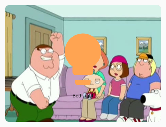
- type: background
for: hui-button-card $ ha-card
camera_entity: camera.demo_camera
camera_zoom: 1.3
camera_position: bottom-left
element:
type: button
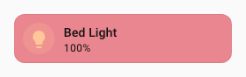
entity: light.bed_light
Entity picture as background
Tip
As for target is ha-card, the ha-card adapter will be used applying card radius and margin to styling to the entity picture background.
type: custom:uix-forge
forge:
mold: card
grid_options:
rows: 3
sparks:
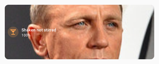
- type: background
for: hui-tile-card $ ha-card
image_entity: person.james_bond_007
element:
type: tile
entity: light.bed_light
name: Shaken not stirred
icon: mdi:glass-cocktail
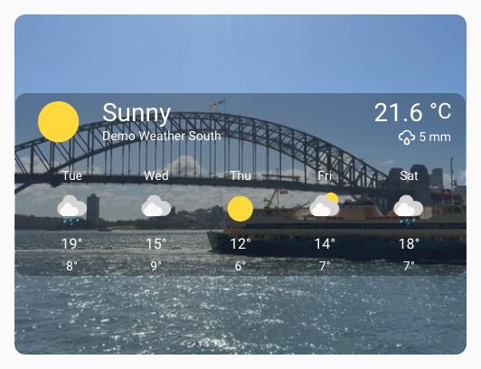
Video background
Tip
As for target is ha-card, the ha-card adapter will be used applying card radius and margin to styling to the video background.
type: custom:uix-forge
forge:
  mold: card
  grid_options:
    columns: 12
    rows: 6
  sparks:
    - type: background
      for: hui-weather-forecast-card $ ha-card
      video_url: /local/media/sydney_ferry.mp4
      opacity: 0.9
element:
  show_current: true
  show_forecast: true
  type: weather-forecast
  entity: weather.demo_weather_south
  forecast_type: daily
  uix:
    style: |
      :host {
        --primary-text-color: white;
        --secondary-text-color: smokewhite;
        --content-border-radius: var(--ha-card-border-radius, 12px);
      }
      .content {
        background: rgba(0,0,0,0.3);
        border-top-left-radius: var(--content-border-radius);
        border-top-right-radius: var(--content-border-radius);
      }
      .forecast {
        background: rgba(0,0,0,0.3);
        border-bottom-left-radius: var(--content-border-radius);
        border-bottom-right-radius: var(--content-border-radius);
      }
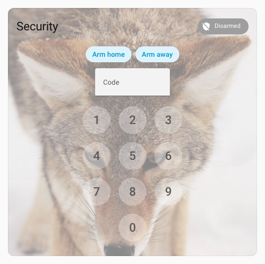
Static image background
Tip
As for target is ha-card, the ha-card adapter will be used applying card radius and margin to styling to the static image background.
type: custom:uix-forge
forge:
  mold: card
  sparks:
    - type: background
      for: hui-alarm-panel-card $ ha-card
      image_url: https://picsum.photos/id/582/600/600
      opacity: 0.5
element:
  type: alarm-panel
  states:
    - arm_home
    - arm_away
  entity: alarm_control_panel.security
  uix:
    style: |
      ha-control-button {
        --control-button-background-color: white;
        --control-button-background-opacity: 0.3;
      }
Controlling image position and size
The background key can be combined with image_url (or image_entity) to override how the image is rendered. Use an object with sub-properties to adjust positioning, sizing, and other CSS background properties while keeping the image intact:
type: custom:uix-forge
forge:
  mold: card
  sparks:
    - type: background
      for: hui-tile-card $ ha-card
      image_url: https://picsum.photos/id/582/600/600
      background:
        position: "top center"
        size: contain
        repeat: "no-repeat"
element:
  type: tile
  entity: light.bed_light
Note
When background is used alongside image_url or image_entity, only object sub-properties (e.g. position, size) are applied as overrides on top of the image. Using a plain string value (e.g. background: red) will replace the entire background shorthand, which also removes background-image. Use a plain string only when you want to completely replace the image with a different background, such as a solid color or gradient.
Background using full CSS background
Tip
As for target is ha-card, the ha-card adapter will be used applying card radius and margin to styling to the full CSS background.
type: custom:uix-forge
forge:
  mold: card
  sparks:
    - type: background
      for: hui-tile-card $ ha-card
      background: linear-gradient(90deg,rgba(131, 58, 180, 1) 0%, rgba(253, 29, 29, 1) 50%, rgba(252, 176, 69, 1) 100%)
element:
  type: tile
  entity: light.bed_light
  uix:
    style: |
      :host {
        --primary-text-color: white;
      }
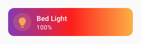
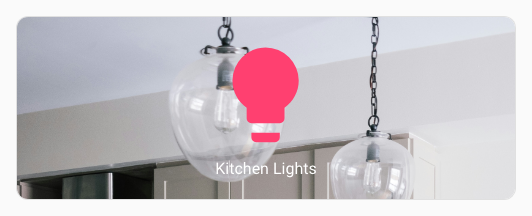
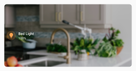
Image from media library
Tip
As for target is ha-card, the ha-card adapter will be used applying card radius and margin to styling to the full CSS background. Here also the background: has position: top set to move the background image to top.
type: custom:uix-forge
forge:
  mold: card
  grid_options:
    columns: 12
    rows: 3
  sparks:
    - type: background
      for: hui-button-card $ ha-card
      image_url: "media-source://media_source/local/kitchen.jpg"
      background:
        position: top
element:
  type: button
  entity: light.kitchen_lights
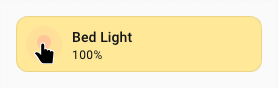
State-driven background color using a template
All forge config values support Jinja2 templates. Use the background key together with a template to drive the color from entity state:
type: custom:uix-forge
forge:
  mold: card
  sparks:
    - type: background
      for: hui-tile-card $ ha-card
      background:
        color: >-
          {% if is_state(config.element.entity, 'on') %}
            rgba(255, 200, 0, 0.4)
          {% else %}
            rgba(100, 100, 100, 0.2)
          {% endif %}
element:
  type: tile
  entity: light.bed_light
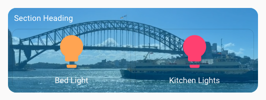
Section background
Here the standard section background is used to give a stronger light-blue background to the video. The section (hui-section) adapter automatically zeros out the section-container padding so there is no double-padding effect.
Tip
The YAML is for a complete section of a sections dashboard. You can edit a section's YAML directly by editing the section, the using Edit in YAML from the three dots menu.
type: custom:uix-forge
forge:
  mold: section
  sparks:
    - type: background
      video_url: /local/media/sydney_ferry.mp4
      opacity: 0.7
element:
  type: grid
  cards:
    - type: heading
      heading: Section Heading
    - type: button
      entity: light.bed_light
    - type: button
      entity: light.kitchen_lights
  uix:
    style: |
      :host {
        --primary-text-color: white;
      }
column_span: 1
background:
  color: light-blue
  opacity: 100
Styling the background container with UIX Styling
Use the class key to add a CSS class to the background container, then target the background div within the background container with a UIX style path:
type: custom:uix-forge
forge:
  mold: card
  grid_options:
    rows: 4
  sparks:
    - type: background
      for: hui-tile-card $ ha-card
      image_url: /local/media/kitchen.jpg
      class: my-background
  uix:
    style:
      .: |
        :host {
          --primary-text-color: white;
        }
      "hui-tile-card $ ha-card $": |
        .my-background div {
          filter: blur(2px) brightness(0.8);
        }
element:
  type: tile
  entity: light.bed_light
Adding background to a dashboard header
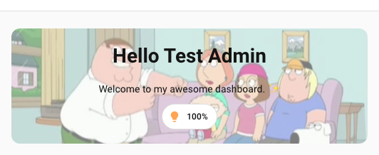
A sections dashboard header in its entirety (title and badges) cannot be forged with UIX Forge. However the markdown card used the in header can be replaced with a forged card. Using cards of your choice along with custom:badge-horizontal-container-card in a vertical stack, you can simulate a full header including badges and use the background spark to inject a background behind the 'full' header.
You can replace the heading markdown card by simply using Show code editor after clicking the + Add title button in the header area of the dashboard in edit mode.
Border radius needs to be applied to the background as there is no adapter doing this automatically. Likewise, padding needs to be applied to the included vertical stack root.
type: custom:uix-forge
forge:
  mold: card
  sparks:
    - type: background
      for: "hui-vertical-stack-card $ #root"
      camera_entity: camera.demo_camera
      opacity: 0.5
      class: heading-background
element:
  type: vertical-stack
  cards:
    - type: markdown
      text_only: true
      content: |-
        # Hello {{ user }}
        Welcome to my awesome dashboard. ✨
    - type: custom:badge-horizontal-container-card
      badges:
        - type: entity
          show_name: false
          show_state: true
          show_icon: true
          entity: light.bed_light
      badges_align: center
  uix:
    style: |
      #root {
        padding: 20px !important;
      }
      .heading-background {
        border-radius: var(--ha-card-border-radius, var(--ha-border-radius-lg));
      }
As full raw dashboard config
Place the forged header card under card: within header:
views:
  - type: sections
    max_columns: 4
    title: Test Background
    path: test-background
    header:
      card:
        type: custom:uix-forge
        forge:
          mold: card
          sparks:
            - type: background
              for: "hui-vertical-stack-card $ #root"
              camera_entity: camera.demo_camera
              opacity: 0.5
              class: heading-background
        element:
          type: vertical-stack
          cards:
            - type: markdown
              text_only: true
              content: |-
                # Hello {{ user }}
                Welcome to my awesome dashboard. ✨
            - type: custom:badge-horizontal-container-card
              badges:
                - type: entity
                  show_name: false
                  show_state: true
                  show_icon: true
                  entity: light.bed_light
              badges_align: center
          uix:
            style: |
              #root {
                padding: 20px !important;
              }
              .heading-background {
                border-radius: var(--ha-card-border-radius, var(--ha-border-radius-lg));
              }