 Tooltip spark
The tooltip spark attaches a styled tooltip to any element inside a UIX Forge forged element. It uses Home Assistant's wa-tooltip component (the same component used throughout the HA frontend), so it integrates with the HA design system, supports 12 placement positions and floats above all other UI layers via the browser's Popover API.
Basic usage
Add a tooltip entry to forge.sparks:
type: custom:uix-forge
forge:
  mold: card
  sparks:
    - type: tooltip
      for: hui-tile-card
      content: Turn on the lights
element:
  type: tile
  entity: light.kitchen_lights
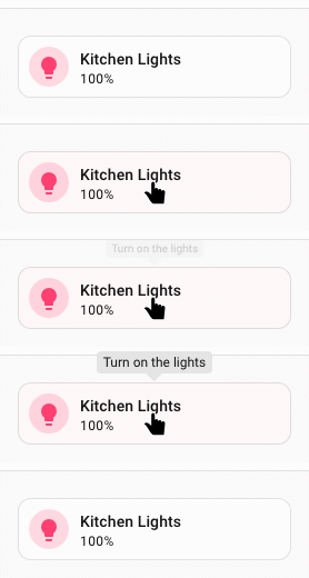
The for value is a selector that locates the target element within the forged element. It supports the same DOM navigation syntax as UIX styles, including $ to cross shadow-root boundaries.
type: custom:uix-forge
forge:
  mold: card
  sparks:
    - type: tooltip
      for: hui-tile-card $ ha-tile-icon
      content: Toggle the living room light
element:
  type: tile
  entity: light.kitchen_lights
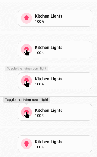
Only the first element matched by for gets the tooltip.
Configuration
| Key | Type | Required | Default | Description |
|---|---|---|---|---|
type |
string |
✅ | — | Must be tooltip. |
for |
string | element |
UIX selector for the target element. When the UIX Forge element is using Blank card config, the default is uix-forge-blank-card $ div.content. Otherwise, the default of element refers to the root of the forged element. |
|
content |
string | "" |
HTML content of the tooltip body. | |
placement |
string | "top" |
Tooltip position relative to the target. Placement values are top, top-start, top-end, bottom, bottom-start, bottom-end, left, left-start, left-end, right · right-start, right-end. |
|
distance |
number | 8 |
Gap in pixels between the tooltip and the target element. | |
skidding |
number | 0 |
Offset in pixels along the target element's axis. | |
show_delay |
number | 150 |
Milliseconds to wait before showing the tooltip. | |
hide_delay |
number | 150 |
Milliseconds to wait before hiding the tooltip. | |
trigger |
string | "hover focus" |
Space-separated activation modes: hover, focus, click, or manual. |
|
open |
boolean | false |
Set the tooltip's open state when the spark configuration changes. This is particularly useful with trigger: manual. |
|
without_arrow |
boolean | false |
Set to true to hide the directional arrow. |
Tip
You can use the uix_forge_path() DOM helper to take the guesswork out of finding the right path for for.
When hover is enabled, the tooltip remains open while the pointer moves from the target into the tooltip body. This allows content constrained with --uix-tooltip-max-height and --uix-tooltip-overflow: auto to be scrolled. manual does not activate automatically; set open: true to open it from the spark configuration.
forge:
  sparks:
    - type: tooltip
      trigger: manual
      open: true
      content: This tooltip is opened by the spark configuration
Templates in content
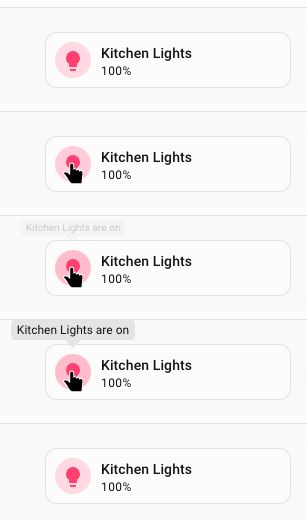
The content value is part of the forge config and is therefore processed as a template, giving you access to entity states, the config object and any other UIX template variables:
type: custom:uix-forge
forge:
  mold: card
  sparks:
    - type: tooltip
      for: "hui-tile-card $ ha-tile-icon"
      content: >-
        {{ state_attr(config.element.entity, 'friendly_name') }} is
        {{ states(config.element.entity) }}
element:
  type: tile
  entity: light.kitchen_lights
Tooltip on a badge
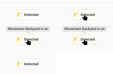
Here the tooltip works on hui-badge which is the element forged by UIX Forge. Hence for: is not required as the default for: element will select hui-badge, the forged element. Generally tooltips will work with the default for: element and you only need to be more specific based on your specific use case.
# A badge placed in the dashboard header
    badges:
      - type: custom:uix-forge
        forge:
          mold: badge
          sparks:
            - type: tooltip
              content: >-
                {{ state_attr(config.element.entity, 'friendly_name') }} is
                {{ states(config.element.entity) }}
        element:
          type: entity
          entity: binary_sensor.movement_backyard
Customising tooltip appearance
The tooltip spark injects CSS variables into the wa-tooltip element. Override them by setting --uix-tooltip-* variables on the forged element's uix.style (or in a theme).
Note
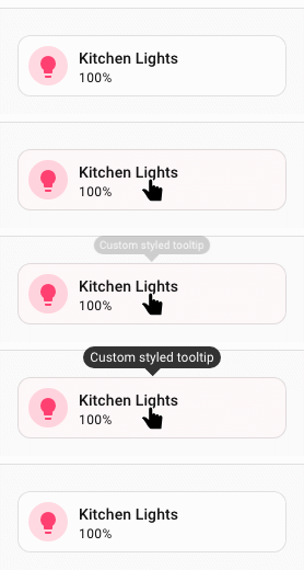
As a tooltip is added as a sibling to the element it is for, if you wish to style the tooltip you will need to make sure your styled element is a parent of the for element. In the styling example, the styles are applied to :host and the tooltip applied to ha-card in the hosts shadow root.
type: custom:uix-forge
forge:
  mold: card
  sparks:
    - type: tooltip
      for: hui-tile-card $ ha-card
      content: Custom styled tooltip
element:
  type: tile
  entity: light.kitchen_lights
  uix:
    style: |
      :host {
        --uix-tooltip-background-color: #333;
        --uix-tooltip-content-color: #fff;
        --uix-tooltip-border-radius: 999px;
      }
CSS variables reference
Info
The following CSS var defaults were updated in 8.3.0.
--uix-tooltip-background-color(default nowvar(--ha-color-surface-default))--uix-tooltip-content-color(add--ha-tooltip-text-colorto default chain)--uix-tooltip-font-size(default now--ha-font-size-m)--uix-tooltip-padding(updated token size default resolving to same 8px)--uix-tooltip-border-radius(default now--ha-border-radius-md)--uix-tooltip-box-shadow(now uses--ha-tooltip-box-shadowand defaults tovar(--ha-box-shadow-m))
| CSS variable | Default | Description |
|---|---|---|
--uix-tooltip-background-color |
var(--ha-tooltip-background-color, var(--ha-color-surface-default)) |
Tooltip background color. |
--uix-tooltip-content-color |
var(--ha-tooltip-text-color, var(--primary-text-color)) |
Tooltip text color. |
--uix-tooltip-font-family |
--ha-font-family-body |
Font family. |
--uix-tooltip-font-size |
--ha-font-size-m |
Font size. |
--uix-tooltip-font-weight |
--ha-font-weight-medium |
Font weight. |
--uix-tooltip-line-height |
--ha-line-height-condensed |
Line height. |
--uix-tooltip-padding |
var(--ha-tooltip-padding, var(--ha-space-2)) |
Padding inside the tooltip. |
--uix-tooltip-border-radius |
--ha-border-radius-md |
Border radius. |
--uix-tooltip-arrow-size |
var(--ha-tooltip-arrow-size, 8px) |
Size of the directional arrow. If you want to have no arrow either set without_arrow: true in tooltip config, or style --ha-tooltip-arrow-size: 0px or --uix-tooltip-arrow-size: 0px |
--uix-tooltip-border-width |
— | Border width (unset by default). |
--uix-tooltip-border-color |
— | Border color (unset by default). |
--uix-tooltip-border-style |
— | Border style (unset by default). |
--uix-tooltip-max-width |
30ch |
Maximum width of the tooltip. |
--uix-tooltip-max-height |
none |
Maximum height of the tooltip body. |
--uix-tooltip-overflow |
visible |
Overflow behaviour for the tooltip body. Use auto to scroll constrained content. |
--uix-tooltip-overflow-wrap |
normal |
Overflow-wrap behaviour. |
--uix-tooltip-show-duration |
100ms |
Duration of the show animation. |
--uix-tooltip-hide-duration |
100ms |
Duration of the hide animation. |
--uix-tooltip-opacity |
1 |
Tooltip opacity. |
--uix-tooltip-box-shadow |
var(--ha-tooltip-box-shadow, var(--ha-box-shadow-m)) |
Box shadow. |
--uix-tooltip-text-align |
center |
Text alignment. |
--uix-tooltip-text-decoration |
none |
Text decoration. |
--uix-tooltip-text-transform |
none |
Text transform. |