Map spark
The map spark adds advanced map state management to a map card used inside a UIX Forge forged element. It supports five modes:
- Memory mode (
memory: true): Captures the current map zoom and centre before each update and restores them afterwards, so the user's view is always preserved. Without it, every forge template update causes the map to reset to its default zoom level and centre position. - Fit map mode (
fit_map: true): Fits the map view when map card does not auto fit on load when used in custom cards which may hide the map initially. e.g.custom: auto-entities. - Tour mode (
tour: true | object): Automatically moves the map between a list of points of interest. A pause/play button is injected into the map. Whentour: trueall defaults are used; pass an object to customise behaviour. - Hours to show slider mode (
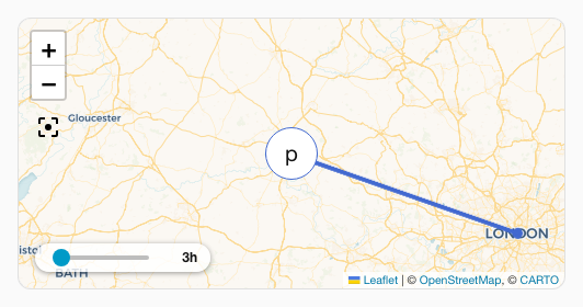
hours_to_show: true | object): Injects an interactiveha-slideroverlay into the map allowing users to adjust the hours of history loaded and rendered in real-time. - Entity filter overlay mode (
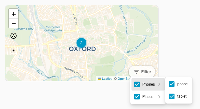
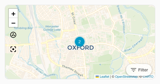
entity_filter: true | object): Injects an interactive checkable dropdown checklist overlay into the map allowing users to toggle visible entities on the map in real-time.
Basic usage
type: custom:uix-forge
forge:
  mold: card
  sparks:
    - type: map
      memory: true
element:
  type: map
  entities:
    - device_tracker.phone
Configuration
| Key | Type | Default | Description |
|---|---|---|---|
type |
string | — | Must be map. |
memory |
boolean | false | Save/restore zoom and centre before/after each update. |
fit_map |
boolean | false | Fit map view to all entities once map is visible (useful for cards hidden on load). |
tour |
boolean or object | false | Enable tour mode. true uses all defaults; pass an object to customise (see below). |
hours_to_show |
boolean or object | false | Enable hours to show slider overlay. true uses all defaults; pass an object to customise (see below). |
entity_filter |
boolean or object | false | Enable entity filter checklist dropdown overlay. true uses all defaults; pass an object to customise (see below). |
Tour sub-keys
| Key | Type | Default | Description |
|---|---|---|---|
period |
string or number | 10s |
Time to spend at each point of interest. Accepts a human-readable duration (e.g. "30s", "2m") or a number in milliseconds. |
zoom |
number | 14 |
Default zoom level used when moving to a POI. |
icon_pause |
string | mdi:pause |
Icon shown on the overlay button while the tour is playing. |
icon_play |
string | mdi:play |
Icon shown on the overlay button while the tour is paused. |
icon_position |
object | {bottom: 40px, right: 10px} |
CSS position of the pause/play button. Accepts top, bottom, left, and right keys (numbers are treated as pixels). |
poi |
list | (unset) | List of points of interest. When omitted, the entities declared on the ha-map card are used. |
Each poi list entry may contain:
| Key | Type | Description |
|---|---|---|
entity |
string | Entity ID. Must be present in the ha-map's entities list. Lat/lng are read from hass state attributes. |
latitude |
number | Latitude (required when entity is not set). |
longitude |
number | Longitude (required when entity is not set). |
zoom |
number | Per-POI zoom override. |
Hours to Show sub-keys
| Key | Type | Default | Description |
|---|---|---|---|
min |
number | 0 |
Minimum hours to show on the slider. |
max |
number | 24 |
Maximum hours to show on the slider. |
step |
number | 1 |
Increment step size of the slider. |
position |
object | {bottom: 40px, right: 10px} |
CSS position of the slider capsule. Accepts top, bottom, left, and right keys (numbers are treated as pixels). |
tooltip_distance |
number | 20 |
Distance in pixels of slider tooltip away from thumb. |
Controls with no position configured, or an explicit {bottom: 40px, right: 10px}, share a horizontal row above the map attribution. Other positions, including {bottom: 10px, right: 10px}, use the configured offsets independently.
Entity Filter sub-keys
| Key | Type | Default | Description |
|---|---|---|---|
position |
object | {bottom: 40px, right: 10px} |
CSS position of the filter button capsule. Accepts top, bottom, left, and right keys (numbers are treated as pixels). |
size |
string | s |
Button size (e.g. s, m, l). |
variant |
string | neutral |
Button variant brand/style (e.g. brand, neutral, danger, warning, success). |
appearance |
string | filled |
Button presentation appearance (e.g. accent, filled, plain). |
icon |
string | mdi:filter-variant |
Trigger button start-icon representation. |
label |
string | Filter |
Trigger button label string. Set to empty string to disable. |
group |
boolean or object | false | Group entities according to their domain. Set to true to use defaults, or an object to set labels for each entity domain grouping. |
Entity filter group sub-keys
| Key | Type | Default | Description |
|---|---|---|---|
persons |
string | Persons |
Label for the person domain entity grouping. |
trackers |
string | Trackers |
Label for the device_tracker domain entity grouping. |
zones |
string | Zones |
Label for the zone domain entity grouping. |
Tour CSS variables
The pause/play button can be styled using CSS variables placed on the ha-card or any ancestor:
| Variable | Default | Description |
|---|---|---|
--uix-map-tour-icon-color |
var(--primary-color) |
Icon color. |
--uix-map-tour-icon-ring-color |
var(--uix-map-tour-icon-color) |
Countdown ring color (defaults to icon color). |
--uix-map-tour-icon-background |
rgba(255,255,255,0.8) |
Button background. |
--uix-map-tour-icon-box-shadow |
0 1px 5px rgba(0,0,0,0.4) |
Box shadow of the icon container. |
--uix-map-tour-icon-width |
auto |
Button width. |
--uix-map-tour-icon-height |
auto |
Button height. |
--uix-map-tour-icon-border-radius |
9999px |
Button border radius (pill by default). |
--uix-map-tour-icon-z-index |
1000 |
Button z-index (Leaflet controls use 1000). |
Hours to Show CSS variables
The history duration slider can be styled using CSS variables placed on the ha-card or any ancestor:
| Variable | Default | Description |
|---|---|---|
--uix-map-slider-background |
rgba(255,255,255,0.8) |
Background color of slider container. |
--uix-map-slider-text-color |
var(--primary-text-color, #212121) |
Color of the duration label next to the slider. |
--uix-map-slider-width |
100px |
Explicit width of the slider component. |
--uix-map-slider-border-radius |
9999px |
Slider container border radius (pill by default). |
--uix-map-slider-padding |
4px 12px |
Padding of the capsule container. |
--uix-map-slider-box-shadow |
0 1px 5px rgba(0,0,0,0.4) |
Box shadow of the container element. |
--uix-map-slider-z-index |
1000 |
Controls overlay depth of the slider capsule. |
--uix-map-slider-label-min-width |
28px |
Minimum width of the duration label. |
--uix-map-slider-thumb-size |
(unset) | Height and width of the slider thumb. |
--uix-map-slider-thumb-height |
16px |
Height of the slider thumb component structure (defaults to thumb-size if set). |
--uix-map-slider-thumb-width |
16px |
Width of the slider thumb component structure (defaults to thumb-size if set). |
--uix-map-slider-track-size |
4px |
Thickness of the slider track. |
--uix-map-slider-track-color |
var(--disabled-color) |
Background base track color. |
--uix-map-slider-indicator-color |
var(--primary-color) |
Color of the active indicator bar. |
--uix-map-slider-thumb-color |
var(--uix-map-slider-indicator-color) |
Color of the circular slider thumb. |
--uix-map-slider-thumb-hover-opacity |
0.08 |
Hover opacity surrounding the thumb. |
--uix-map-slider-thumb-pressed-opacity |
0.12 |
Opacity of thumb halo while active/pressed. |
--uix-map-slider-thumb-box-shadow |
inherit |
Custom shadow styling applied to the interactive thumb item. |
--uix-map-slider-tooltip-color |
var(--primary-text-color) |
Text color inside the popup thumb tooltip. |
--uix-map-slider-tooltip-font-size |
var(--ha-font-size-s) |
Font size of text inside the tooltip. |
--uix-map-slider-tooltip-font-weight |
var(--ha-font-weight-normal) |
Font thickness of elements inside tooltip. |
--uix-map-slider-tooltip-background-color |
var(--secondary-background-color) |
Background color of popup tooltip bubble. |
--uix-map-slider-tooltip-border-radius |
var(--ha-border-radius-sm) |
Corner rounding of tooltip bubble. |
--uix-map-slider-tooltip-border-width |
0px |
Border thickness of tooltip. |
--uix-map-slider-tooltip-border-color |
currentColor |
Border color of tooltip bubble. |
--uix-map-slider-tooltip-border-style |
none |
Border line style. |
Entity Filter CSS variables
The entity filter dropdown can be styled using CSS variables placed on the ha-card or any ancestor:
| Variable | Default | Description |
|---|---|---|
--uix-map-entity-filter-background |
rgba(255,255,255,0.8) |
Background color of entity filter container. |
--uix-map-entity-filter-padding |
4px |
Padding of the filter capsule container. |
--uix-map-entity-filter-border-radius |
9999px |
Entity filter container border radius (pill by default). |
--uix-map-entity-filter-box-shadow |
0 1px 5px rgba(0,0,0,0.4) |
Box shadow of the container element. |
--uix-map-entity-filter-z-index |
1000 |
Controls overlay depth of the filter capsule. |
--uix-map-entity-filter-dropdown-min-width |
180px |
Minimum width of the opened dropdown menu list. |
--uix-map-entity-filter-item-icon-color |
var(--ha-color-fill-neutral-loud-resting) |
Color of the check icon of entity filter list items. |
--uix-map-entity-filter-item-icon-checked-color |
var(--uix-map-entity-filter-item-icon-color, var(--primary-color)) |
Color of the check icon of entity filter items when checked. |
How it works
Memory mode:
Each time the forged element is about to refresh due to a forge template update, the spark:
- Reads the current
zoomandcenterfrom the map renderer insideha-map. - Waits for the forged element and then
ha-mapto finish their own update cycle. - Restores the saved position through Home Assistant's map engine without triggering an animation.
If the map renderer has not yet initialised when the refresh fires (e.g. on initial render) the save step is skipped and no restore is attempted, so the map displays its default view on first load.
Fit map mode:
After the forged element and ha-map finish updating and once the map engine has a usable size, the spark will call fitMap() on ha-map.
Tour mode:
After the map is ready (and after fit_map completes if both are configured), the spark:
- Resolves the POI list (from
poiconfig, or by readinglatitude/longitudefrom hass state attributes of the ha-map entities). - Injects a
ha-icon-buttonoverlay into the map renderer container with a circular SVG countdown ring around it. - Moves the map to the first POI immediately, then starts a repeating timer that advances to the next POI every
periodseconds through the map engine. - The countdown ring animates from full to empty over each
period, giving a visual indication of time remaining at the current POI. - When the user clicks the pause/play button, the timer is stopped or restarted and the countdown ring is hidden or restarted.
When memory: true and tour are both active, hass-update memory restores are suppressed while the tour is playing so that the tour animation is not interrupted.
Hours to show slider mode:
When active, the spark:
- Renders a horizontal
ha-slidercontrol in a capsule-shaped overlay container. - If
touris also active and at the default position, the slider is automatically shifted leftwards to prevent visual overlapping. - Automatically sets, clamps, and updates
hui-map-card_config.hours_to_showbased on slider drags and releases to fetch history records in real-time. - Smoothly preserves the user's selected value across template-driven forge re-renders.
Entity filter overlay mode:
When active, the spark:
- Renders a dropdown overlay using
ha-dropdownwith a triggerha-button. - Resolves and displays each map entity as a checkbox using Friendly Name.
- Directly filters visible entities. As a map card will error with no entities, deselecting any last selected entity is disabled.
- If the
show_all: trueis set in forged map card config, aShow Alloption will also show in the dropdown. While entities are filtered, any new map entities will not show untilShow Allis selected. - If
tourorhours_to_showis also active and at the default position, the slider is automatically shifted leftwards to prevent visual overlapping. - If
touris also active, changing filtered entities will cause the map tour to restart.
Note
The spark targets the hui-map-card element inside the forged element as well as the ha-map element within its shadow root. It supports Home Assistant's map engine (MapLibre when available, with Leaflet fallback) and older Leaflet-based frontends. If the forged element is not a map card (or is wrapped in another element that does not expose hui-map-card), none of the modes have any effect.
Examples
Using fit map mode with auto-entities
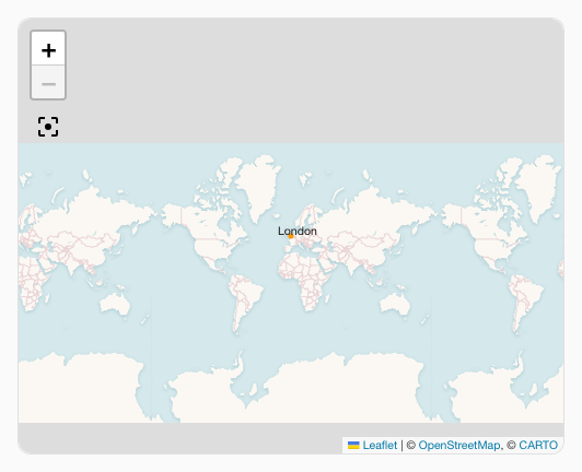
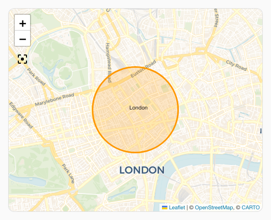
When using a map card with custom:auto-entities the way auto-entities hides the map card will mean it does not fit on load. Fit map mode can be used in this case to make sure the map fits on first load.
No include filters have been used for brevity of the example.
type: custom:auto-entities
entities:
  - zone.london
filter:
  include: []
  exclude: []
card:
  type: custom:uix-forge
  forge:
    mold: card
    sparks:
      - type: map
        fit_map: true
  element:
    type: map
    fit_zones: true
    uix:
      style: |
        :host {
          display: block;
          height: 400px;
        }
Without fit_map: true:
With fit_map: true:
Tour mode with default settings
Automatically cycle through all map entities using defaults (10 s per stop, pause/play button in bottom-right corner):
type: custom:uix-forge
forge:
  mold: card
  sparks:
    - type: map
      tour: true
element:
  type: map
  entities:
    - device_tracker.my_phone
    - device_tracker.my_tablet
Map spark tour mode example animation (mp4)
Tour mode with custom POI list
Fly between fixed coordinates and specific entities with individual zoom levels:
type: custom:uix-forge
forge:
  mold: card
  sparks:
    - type: map
      tour:
        period: 15s
        zoom: 13
        icon_pause: mdi:pause-circle
        icon_play: mdi:play-circle
        icon_position:
          bottom: 16px
          left: 16px
        poi:
          - latitude: 51.614387
            longitude: -0.731585
            zoom: 11
          - entity: device_tracker.my_tablet
            zoom: 14
element:
  type: map
  entities:
    - device_tracker.my_phone
    - device_tracker.my_tablet
Map spark tour mode with pois example animation (mp4)
Styling the tour button
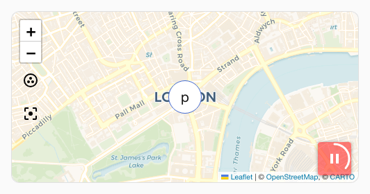
Override the default pill shape with rounded corners and a dark background:
type: custom:uix-forge
forge:
  mold: card
  sparks:
    - type: map
      tour: true
element:
  type: map
  entities:
    - device_tracker.phone
  uix:
    style: |
      ha-card {
        --uix-map-tour-icon-color: white;
        --uix-map-tour-icon-background: rgba(255,0,0,0.5);
        --uix-map-tour-icon-border-radius: 4px;
      }
Hours to show history slider
Enable a customizable history duration slider to load between 1 and 48 hours of tracker data on the map:
type: custom:uix-forge
forge:
  mold: card
  sparks:
    - type: map
      hours_to_show:
        min: 1
        max: 48
        step: 2
        position:
          bottom: 15px
          left: 15px
element:
  type: map
  hours_to_show: 3
  default_zoom: 8
  entities:
    - device_tracker.phone
Entity selection filter dropdown
Enable an interactive dropdown to toggle entity tracks visibility in real-time:
type: custom:uix-forge
forge:
  mold: card
  sparks:
    - type: map
      entity_filter: true
element:
  type: map
  entities:
    - device_tracker.phone
    - device_tracker.tablet
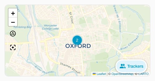
Customise the trigger button text, size, color and icon styling:
type: custom:uix-forge
forge:
  mold: card
  sparks:
    - type: map
      entity_filter:
        label: "Trackers"
        icon: "mdi:account-multiple"
        size: "m"
        variant: "brand"
        appearance: "filled"
element:
  type: map
  entities:
    - device_tracker.phone
    - device_tracker.tablet
Display entity filter grouped by domain with custom labels
type: custom:uix-forge
forge:
  mold: card
  sparks:
    - type: map
      entity_filter:
        group:
          persons: Household
          trackers: Phones
          zones: Places
element:
  type: map
  entities:
    - zone.london
    - device_tracker.phone
    - device_tracker.tablet