Theme Spark
The theme spark applies a frontend theme to a target element.
Use it when you want a forged element to pick up an existing theme without adding extra UIX styling config.
Configuration
| Key | Type | Required | Default | Description |
|---|---|---|---|---|
type |
string | ✅ | — | Must be theme. |
for |
string | element |
UIX selector path for the element to apply the theme to. When the UIX Forge element is using Blank card config, the default is uix-forge-blank-card $ div.content. Otherwise, the default of element refers to the root of the forged element. |
|
theme |
string | — | Theme name to apply. Supports templates. |
Tip
theme config supports templates. To revert the theme back to the main theme, have your template return an empty string "". This will apply the main theme to for. As themes are applied by setting inline style properties to the element, your override theme should include the same theme elements, or be a subset of elements of the main theme. If you are using theme sparks on a cascade of forged elements, it is best to have each theme override be a subset of the prior theme override, or unexpected results may occur.
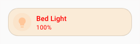
Example - basic
Theme:
my-theme:
  primary-text-color: red
  ha-card-border-radius: 20px
  ha-card-background: antiquewhite
UIX Forge:
type: custom:uix-forge
forge:
  mold: card
  sparks:
    - type: theme
      for: element
      theme: my-theme
element:
  type: tile
  entity: light.bed_light

Example - template
Themes:
my-blue-theme:
  primary-text-color: blue
  ha-card-border-radius: 20px
  ha-card-background: lightpink

my-red-theme:
  primary-text-color: red
  ha-card-border-radius: 20px
  ha-card-background: antiquewhite
UIX Forge:
type: "custom:uix-forge"
forge:
  mold: card
  sparks:
    - type: theme
      for: element
      theme: "{{ 'uix-doc-spark-theme-template-red' if is_state(config.element.entity, 'on') else 'uix-doc-spark-theme-template-blue' }}"
element:
  type: tile
  entity: light.bed_light
Tip
You can use the uix_forge_path() DOM helper to take the guesswork out of finding the right path for for.