Form spark
The form spark embeds Home Assistant's <ha-form> component in a forged element. Its schema uses the standard Home Assistant form schema: each field has a unique name, optional label and default, and a Home Assistant selector.
Use the optional submit and clear buttons to run Home Assistant actions. The current form values are merged into the action's data; a form value takes precedence when it has the same key as static action data.
Buttons are optional. This allows a form spark inside a UIX Popover action to use the popover footer buttons instead. When a form spark is present in a popover card, its current values are automatically merged into the tap_action, hold_action, or double_tap_action of either footer button.
Basic usage
This blank Forge card needs no placement selector. The form spark automatically inserts itself into the blank card content.
type: custom:uix-forge
forge:
  mold: card
  sparks:
    - type: form
      density: dense
      schema:
        - name: message
          label: Message
          selector:
            text: {}
        - name: priority
          label: Priority
          default: normal
          selector:
            select:
              options:
                - normal
                - urgent
      submit:
        text: Send
        icon: mdi:send
        icon_position: end
        action:
          action: perform-action
          perform_action: script.send_message
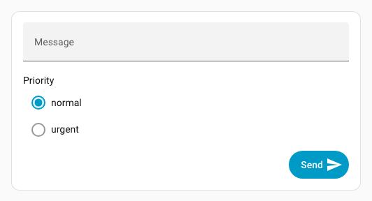
The action receives data.message and data.priority which will be available in the script as {{ message }} and {{ priority }}. By default, submit clears the form after a valid action is dispatched.
Send values to UIX actions
Form values also flow into UIX actions used through fire-dom-event.
Event action
With action: event, the form values are appended to the custom event's detail. Static data values are retained, except that a form field with the same key wins. This example dispatches uix-form-submitted on window with source, message, and priority in its detail; a form field named source would override contact-form.
submit:
  action:
    action: fire-dom-event
    uix:
      action: event
      name: uix-form-submitted
      data:
        source: contact-form
JavaScript action
With action: javascript, the form values are appended to variables, so the code can use variables.<field-name>. Static variables are retained, except that a form field with the same key wins; a form field named source would override contact-form.
submit:
  action:
    action: fire-dom-event
    uix:
      action: javascript
      data:
        variables:
          source: contact-form
        code: >
          console.info(`Submitted: Message: ${variables.message},
          Priority: ${variables.priority} from ${variables.source}`);
Markdown card placement
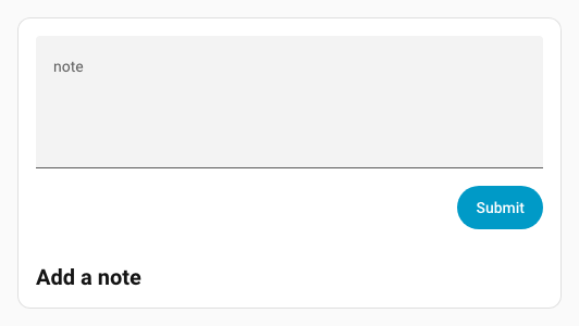
For a forged Markdown card, the spark automatically places the form after the Markdown content. The equivalent explicit placement is:
after: hui-markdown-card $ ha-markdown
This is useful when you need to be explicit, or when moving the form before the content:
type: custom:uix-forge
forge:
  mold: card
  sparks:
    - type: form
      before: hui-markdown-card $ ha-markdown
      schema:
        - name: note
          selector:
            text:
              multiline: true
      submit:
        action:
          action: perform-action
          perform_action: script.save_note
element:
  type: markdown
  content: "## Add a note"
Configuration
| Key | Type | Required | Default | Description |
|---|---|---|---|---|
type |
string | ✅ | — | Must be form. |
schema |
list | ✅ | — | Home Assistant ha-form schema. Each selector field normally provides name, optional label and default, and selector. |
after |
string | see placement | UIX selector for the reference element. Inserts the form as a sibling after it. | |
before |
string | — | UIX selector for the reference element. Inserts the form as a sibling before it. | |
for |
string | see placement | Alias for after. |
|
density |
spacious, reduced, or dense |
spacious |
Vertical field spacing. See Density. | |
submit |
object | — | Adds a Submit button. See below. | |
clear |
object or true |
— | Adds a Clear button. Use true for the default button, or an object to configure it. See below. |
When neither after, before, nor for is given, a blank Forge card uses uix-forge-blank-card $ div.content; a Markdown card uses hui-markdown-card $ ha-markdown. Other forged element types need an explicit placement selector.
submit
| Key | Type | Default | Description |
|---|---|---|---|
action |
action object | — | Home Assistant action to run with the current form data. |
text |
string | Submit |
Button text. |
icon |
string | — | Optional MDI icon. |
icon_position |
start or end |
start |
Places the icon in the corresponding ha-button slot. |
variant |
string | brand |
Button color variant: brand, neutral, danger, warning, or success. |
appearance |
string | accent |
Button appearance: accent, filled, outlined, or plain. |
clear |
boolean | true |
Clear all form inputs after a valid submit action is dispatched. |
clear
| Key | Type | Default | Description |
|---|---|---|---|
action |
action object | — | Optional Home Assistant action to run with the current form data before clearing. |
text |
string | Clear |
Button text. |
icon |
string | — | Optional MDI icon. |
icon_position |
start or end |
start |
Places the icon in the corresponding ha-button slot. |
variant |
string | neutral |
Button color variant: brand, neutral, danger, warning, or success. |
appearance |
string | filled |
Button appearance: accent, filled, outlined, or plain. |
The Clear button always clears the inputs, whether or not it has an action. Schema defaults provide the initial values on first display; after clearing, fields are always empty. Use clear: true for an unconfigured Clear button.
Density
density controls the vertical gap between fields in Home Assistant's ha-form. It also reduces the vertical margin around radio controls in list selectors; other selector controls keep their usual Home Assistant hit targets.
| Value | Field gap | Use case |
|---|---|---|
spacious |
24px |
Default Home Assistant form layout. |
reduced |
16px |
Compact cards with a small number of fields. |
dense |
8px |
Popovers or cards where vertical space is limited. |
- type: form
  density: dense
  schema:
    - name: note
      selector:
        text: {}
Styling the form and controls
The form uses Home Assistant's normal ha-form and selector controls. CSS custom properties set on the Forge host cascade through the form's open shadow-DOM boundaries, so set them with forge.uix.style and :host.
type: custom:uix-forge
forge:
  mold: card
  uix:
    style: |
      :host {
        /* UIX form layout */
        --uix-form-padding: var(--ha-space-3);
        --uix-form-field-gap: var(--ha-space-2);

        /* Home Assistant ha-input controls used by text selectors */
        --ha-input-padding-bottom: var(--ha-space-1);
        --ha-input-text-align: start;
      }
  sparks:
    - type: form
      density: reduced
      schema:
        - name: note
          selector:
            text: {}
density changes the space between fields and the vertical margin around radio controls in a list selector. reduced uses an 8px top and bottom radio margin; dense uses 4px. The Home Assistant control variables can additionally tune the controls themselves; for example, --ha-input-padding-bottom affects text and number selectors that render an ha-input.
Home Assistant preserves the 56px hit target of text inputs, switches, and standard boolean fields. Those controls do not currently expose a shared public height token, so density deliberately does not shrink their clickable area.
Available tokens
| Variable | Default | Description |
|---|---|---|
--uix-form-padding |
var(--ha-space-4, 16px) |
Space around the form. |
--uix-form-actions-gap |
var(--ha-space-2, 8px) |
Gap between Clear and Submit buttons. |
--uix-form-actions-margin-top |
var(--ha-space-4, 16px) |
Space above the button row. |
--uix-form-field-gap |
density-specific | Overrides the vertical gap between fields. |
--uix-form-radio-option-control-margin |
density-specific | Overrides the radio-control margin used by reduced and dense list selectors. Uses the same four-value order as CSS margin. |
--ha-radio-option-control-margin |
Home Assistant default | Directly sets the control margin for radio options; useful with spacious or when styling individual radio controls. |
--ha-radio-option-toggle-size |
20px |
Diameter of a radio control; does not change the row hit target. |
--ha-checkbox-size |
20px |
Size of a checkbox control; does not change the row hit target. |
--ha-input-padding-top |
unset | Padding above an ha-input. |
--ha-input-padding-bottom |
var(--ha-space-2) |
Padding below an ha-input. |
--ha-input-text-align |
start |
Text alignment in an ha-input. |
--ha-input-required-marker |
"*" |
Required-field marker used by ha-input. |
--ha-space-*, --ha-font-size-*, --primary-color, and --ha-color-* are broader Home Assistant theme tokens that can also be used in the same :host rule. Selector types use different controls, so a token may not apply to every field.
Find selector-specific tokens
Inspect the rendered field in browser DevTools to identify its selector control, then check the component's documented CSS properties and parts. Home Assistant's source is also useful for this:
ha-formdefines the field layout.ha-selectorselects the concrete control for each selector type.ha-inputdocuments properties for text and number selectors, including padding and text alignment.
popover example
This example uses a UIX popover action to host the forged element with form spark. The popover uses its action buttons to call the UIX javascript action. The form fields are automatically placed into variables of the javascript action.
type: button
name: Popover
show_icon: false
tap_action:
  action: fire-dom-event
  uix:
    action: popover
    data:
      buttons:
        primary:
          label: Send
          end_icon: mdi:send
          tap_action:
            action: fire-dom-event
            uix:
              action: javascript
              data:
                variables:
                  source: contact-form
                code: >
                  console.info(`Submitted: Message: ${variables.message},
                  Priority: ${variables.priority} from ${variables.source}`);
      uix:
        style: |
          .uix-popover-card {
            --ha-card-border-width: 0px;
            --ha-card-background: none;
            --uix-form-padding: 0px;
            --ha-radio-option-active-color: red;
          }
      card:
        type: custom:uix-forge
        forge:
          mold: card
          sparks:
            - type: form
              density: dense
              schema:
                - name: message
                  label: Message
                  selector:
                    text: {}
                - name: priority
                  label: Priority
                  default: normal
                  selector:
                    select:
                      options:
                        - normal
                        - urgent
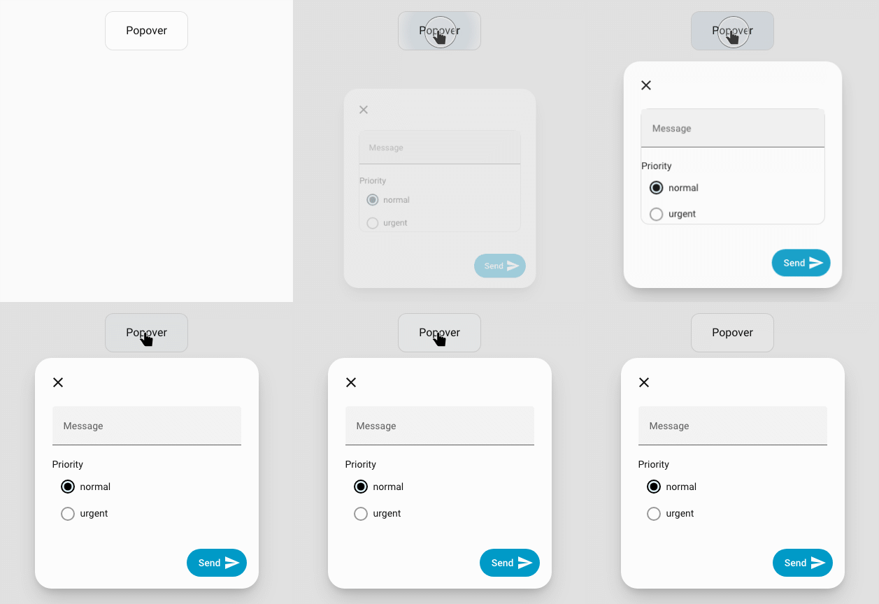
When submitted with message Hello Jim and priority urgent:
Submitted: Message: Hello Jim, Priority: urgent from contact-form