Overlay Icon spark
The overlay-icon spark overlays an icon on any element inside a UIX Forge forged element.
- If
entityis set, the spark renders aha-state-icon. - If
image_urlis set, the spark renders adivwith the image asbackground-image. - Otherwise it renders a
ha-icon.
The icon can come from:
- a fixed MDI or custom icon (
icon) - an image URL (
image_url) - an entity state icon (
entity)
Basic usage
type: custom:uix-forge
forge:
  mold: card
  sparks:
    - type: overlay-icon
      for: hui-tile-card $ ha-tile-icon
      icon: mdi:shimmer
element:
  type: tile
  entity: light.bed_light
Configuration reference
Top-level keys
| Key | Type | Default | Description |
|---|---|---|---|
type |
string | — | Must be overlay-icon. |
for |
string | element |
UIX selector for the element to overlay. Default targets the root of the forged element. |
icon |
string | — | MDI/custom to show. Use one of icon or image_url |
image_url |
string | — | Static image applied as overlay. Supports media-source:// URIs. Use one of icon or image_url. |
entity |
string | — | If provided a state icon is rendered (ha-state-icon). When entity is set, icon and image_url are ignored. |
value |
string | — | If entity is provided you can override the state value used to generate the icon. |
state_color |
boolean | true |
If entity is provided whether state color is used for the icon. |
icon_color |
string | var(--white-color) when target is ha-tile-icon, var(--primary-color) otherwise |
CSS color for the icon. Overrides state color if set. |
icon_position |
object | when target is hui-generic-entity-row: {top: '8px', left: '30px'}; when target is ha-tile-icon: {top: '2px', left: '30px'}; otherwise not set |
Pixel offsets for the icon inside the overlay. Accepts any combination of top, bottom and left, right. Numbers are treated as pixels; strings accept any CSS value. |
icon_size |
number or string | 12px when target is ha-tile-icon, 24px otherwise |
Size of the icon. Numbers are treated as pixels; strings are passed through as-is. |
icon_background |
CSS background | var(--primary-color) when target is ha-tile-icon, otherwise not set |
Explicit CSS background for the icon (overrides the default background-color behavior). |
Customizing the overlay appearance
The overlay icon respects CSS custom properties. Set these on the forged element's uix.style (or in a theme):
| CSS variable | Default | Description |
|---|---|---|
--uix-overlay-icon-z-index |
1 |
Stack order of the overlay. |
--uix-overlay-icon-display |
block |
CSS display of the overlay. |
--uix-overlay-icon-opacity |
1 when target is ha-tile-icon; 0.5 otherwise |
Opacity of the overlay (icon and background combined). |
--uix-overlay-icon-border-radius |
inherit |
Border radius of the overlay (inherits the target's). |
--uix-overlay-icon-row-border-radius |
--uix-overlay-icon-border-radius |
Border radius of the overlay when the forge mold is row. |
--uix-overlay-icon-border |
unset |
Border style CSS. |
--uix-overlay-icon-size |
24px; 12px when target is ha-tile-icon |
Size of the icon. Overrides icon_size from spark config. |
--uix-overlay-icon-color |
var(--primary-color); var(--white-color) when target is ha-tile-icon |
Icon color. |
--uix-overlay-icon-background |
transparent; var(--primary-color) when target is ha-tile-icon |
Background color of the icon element when icon_background is not explicitly set. |
--uix-overlay-icon-border-radius |
none; 50% when target is ha-tile-icon |
Border radius of the icon element. |
--uix-overlay-icon-padding |
0; 2px when target is ha-tile-icon |
Padding around the icon. |
--uix-overlay-icon-position |
none |
CSS translate value applied to the icon (e.g. 30px 6px). |
Warning
As rows in entities card are displayed inline (display: inline) deeper element targeting cannot take place as overlays do not work with elements displayed inline. This means overlay-icon spark can only apply to an entire entity row.
Note
Overlay-based sparks set position: relative on the targeted element when its computed position is static, so the absolute overlay can be anchored correctly.
Examples
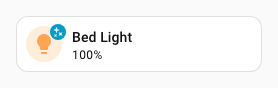
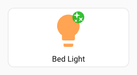
Tile icon overlay badge
type: custom:uix-forge
forge:
  mold: card
  sparks:
    - type: overlay-icon
      for: hui-tile-card $ ha-tile-icon
      icon: mdi:check-decagram
      icon_color: white
      icon_background: "#22b922"
element:
  type: tile
  entity: light.bed_light
Note
For non-entity overlays, when multiple icon source keys are set the spark resolves precedence as:
image_url → icon.
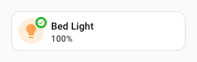
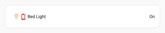
Entity-driven overlay icon with value override
type: entities
entities:
  - type: custom:uix-forge
    forge:
      mold: row
      sparks:
        - type: overlay-icon
          for: $ hui-generic-entity-row
          entity: sensor.outside_temperature_battery
          state_color: true
          value: "10"
      uix:
        style: |
          :host {
            --uix-overlay-icon-opacity: 1;
          }
    element:
      entity: light.bed_light
Overlay icon on a button showing the number of lights on (max 9)
Uses a macro to translate number of lights on to a circle number icon.
An extra button is used to change the state of one light for the animated example.
type: custom:uix-forge
forge:
  macros:
    icon:
      params:
        - group_id
      template: |
        {% set icons =
           { 0: 'mdi:numeric-0-circle',
             1: 'mdi:numeric-1-circle',
             2: 'mdi:numeric-2-circle',
             3: 'mdi:numeric-3-circle',
             4: 'mdi:numeric-4-circle',
             5: 'mdi:numeric-5-circle',
             6: 'mdi:numeric-6-circle',
             7: 'mdi:numeric-7-circle',
             8: 'mdi:numeric-8-circle',
             9: 'mdi:numeric-9-circle',
           }
        %}
        {% set lights = state_attr(group_id, 'entity_id')
          | expand
          | selectattr('state', 'eq', 'on')
          | list
          | count %}
        {% set iconIndex = [lights, 9] | min %}
        {{ icons[iconIndex] }}
  mold: card
  sparks:
    - type: overlay-icon
      icon: |
        {{ icon(config.element.entity) }}
      icon_size: 36px
      icon_color: |
        {{ "var(--state-active-color)" if is_state(config.element.entity, "on")  else "var(--state-inactive-color)" }}
      icon_position:
        left: calc(100% - 36px - 6px)
        top: 6px
element:
  show_name: true
  show_icon: true
  type: button
  entity: light.all_lights
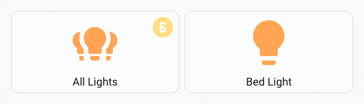
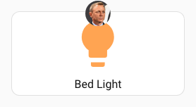
Overlay icon with media source image_url and styling to show as a popover style badge
type: custom:uix-forge
forge:
  mold: card
  sparks:
    - type: overlay-icon
      for: hui-button-card $ ha-card $
      icon_size: 36
      image_url: media-source://media_source/local/daniel_craig_cropped.jpg
  uix:
    style: |
      :host {
        --uix-overlay-icon-opacity: 1;
        --uix-overlay-icon-border-radius: 50%;
        --uix-overlay-icon-position: 0px -16px;
      }
element:
  type: button
  entity: light.bed_light
  uix:
    style: |
      ha-card {
        overflow: visible !important;
      }
Overlay icon on button icon
Tip
If the icon does not show check if the icon should be applied to the target shadowRoot. e.g. overlay icon will not show with for: hui-button-card $ ha-state-icon but will show with for: hui-button-card $ ha-state-icon $. For the former, it will add to DOM but will not show due to DOM structure.
type: custom:uix-forge
  forge:
    mold: card
    sparks:
      - type: overlay-icon
        for: hui-button-card $ ha-state-icon $
        icon: mdi:shimmer
        icon_color: white
        icon_background: "#22b922"
    uix:
      style: |
        :host {
          --uix-overlay-icon-border-radius: 50%;
          --uix-overlay-icon-position: 20px;
          --uix-overlay-icon-opacity: 0.9;
        }
  element:
    show_name: true
    show_icon: true
    type: button
    entity: light.bed_light
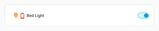
Overlay icon in custom:template-entity-row
Tip
Sometimes the target may just be the element shadowRoot or a div under the shadowRoot. To place an overlay icon in custom:template-entity-row use for: $ #wrapper. You will need to adjust the position to match the position applied automatically by the hui-generic-entity-row target adapter.
type: entities
  entities:
    - type: custom:uix-forge
      forge:
        mold: row
        sparks:
          - type: overlay-icon
            for: "$ #wrapper"
            entity: sensor.outside_temperature_battery
            state_color: true
            value: "10"
            icon_position:
              top: 8px
              left: 30px
        uix:
          style: |
            :host {
              --uix-overlay-icon-opacity: 1;
            }
      element:
        type: custom:template-entity-row
        entity: light.bed_light